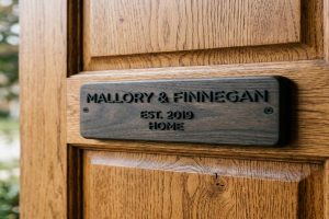
The style of house number that fits your home is determined by four factors: your home’s architectural era, the exterior material palette, the contrast your wall provides, and your setback distance from the road. Modern and contemporary homes match best with sans-serif fonts, matte black or brushed finishes, and floating standoff mounts. Traditional and heritage homes match best with serif or script fonts, brass or bronze finishes, and flush or plaque-style mounts. Every installation must meet IFC 505.1 minimum requirements regardless of style.
- Modern homes: Sans-serif font, matte black or brushed stainless, floating standoff, minimum 4-inch digit height
- Traditional homes: Serif font, brass or bronze, flush or address plaque, minimum 4-inch digit height
- Farmhouse / Cottage: Vintage serif or bold sans, wrought iron or wood, post mount or plaque
- All styles: IFC 505.1 minimum digit height 4 inches, stroke width 0.5 inches, high contrast required
📥 Free Resource: Download our House Number Style Selection Checklist to match the right number style to your home’s architecture before you order.
At a Glance: Architecture-to-Style Matching Table
| Home Architecture | Font Style | Material | Finish | Mount Type | Digit Size |
| Modern / Contemporary | Sans-serif (geometric, clean) | Brushed stainless or powder-coated aluminum | Matte black, brushed, or satin | Floating standoff (10 to 20mm reveal) | 4 to 8 inches |
| Mid-Century Modern | Geometric sans-serif | Brushed aluminum or anodized aluminum | Satin or champagne anodized | Horizontal floating | 4 to 6 inches |
| Traditional / Colonial | Serif (classic curves) | Brass or bronze | Polished or lacquered | Flush mount or address plaque | 4 to 6 inches |
| Victorian / Heritage | Serif or ornate script | Cast iron, bronze, or ceramic | Hand-finished or patinated | Address plaque or wall-panel | 4 to 6 inches |
| Farmhouse / Rustic | Vintage serif or bold sans | Wrought iron, aged steel, or wood | Oil-rubbed, weathered, or painted | Post mount, gate plaque | 4 to 8 inches |
| Cottage / Craft | Playful serif or hand-lettered | Ceramic, copper, or cast iron | Painted, glazed, or natural | Direct flush mount or door panel | 3 to 5 inches |
| Industrial / Loft | Stencil or mono-weight sans | Raw steel, blackened steel, or concrete | Matte black or raw unfinished | Oversized floating standoff | 6 to 12 inches |
What Is the Difference Between Modern and Traditional House Number Styles?
Modern and traditional house number styles differ across four design dimensions: font geometry, material weight, surface finish, and mounting method. Understanding each dimension helps you match the right combination to your home’s exterior character.
Font geometry is the most immediately visible difference. Modern house numbers use sans-serif fonts — typefaces with no decorative strokes at the letter ends. This gives each digit a clean, geometric quality that reads as deliberate and architectural. Traditional house numbers use serif fonts, where small decorative strokes finish the ends of each stroke on every character. These strokes give the font a more classical, formal quality that references historical typography.
Material weight is the second dimension. Modern installations lean toward thin, precisely cut metal — laser-cut stainless steel, anodized aluminum, or matte-black powder-coated metal. Traditional installations lean toward heavier-looking materials — solid cast brass, bronze, or ceramic tiles that communicate permanence and craftsmanship.
Mounting method is the third. Floating standoff mounts, which hold the number away from the wall on stainless steel barrel posts, are almost exclusively associated with modern and contemporary homes. The visible gap and shadow line created by the standoff are part of the design intent. Flush mounts and address plaques, where the number sits directly on or within a framed panel, are the traditional and heritage standard.
Expert Note: Measuring the luminance contrast ratio between a modern matte-black powder-coated aluminum house number face and a white render wall uses a portable spectrophotometer with a 45/0-degree measurement geometry (calibrated to CIE Publication 15 — Colorimetry) to record the CIE L lightness value of both the number face and the wall background in the same ambient light condition. The luminance contrast ratio is calculated as (Lbackground + 5) / (Lnumber + 5). A matte-black number face at L 15 against a white render wall at L 93 produces a contrast ratio of approximately 8:1, which exceeds the 3:1 minimum per *ANSI/SEGD S1.0 — Standards for Environmental Graphic Design and satisfies the IFC 505.1 requirement that numbers must sharply contrast with their background to ensure legibility for emergency responders.
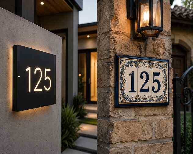
Which House Number Style Fits a Modern or Contemporary Home?
Modern and contemporary homes share a design language built on clean lines, flat surfaces, minimal ornamentation, and a deliberate use of industrial or premium materials. The house numbers should speak the same language.
Modern Home Style Specification:
| Design Element | Recommended Specification | Why It Works |
| Font | Geometric sans-serif (e.g., Futura, Helvetica, Neutra) | Clean, unornamented strokes match flat facade geometry |
| Material | Laser-cut 304 or 316 stainless steel, or anodized aluminum | Premium material weight matches architectural intent |
| Finish | Matte black powder coat (AAMA 2603) or brushed satin (AAMA 611) | Non-reflective surface reads cleanly against render or cladding |
| Mount | Floating standoff at 12 to 20mm reveal | Shadow line creates depth that reads as a design feature, not hardware |
| Digit size | 4 to 8 inches depending on setback | Larger for long driveways — use 1-inch-per-10-feet setback rule |
| Orientation | Horizontal preferred, vertical acceptable on narrow entry pillars | Match to the dominant horizontal or vertical lines of the facade |
| Contrast | Dark numbers on light facades, brushed metal on dark facades | Minimum 3:1 luminance contrast per ANSI/SEGD S1.0 |
The floating standoff mount is the defining detail of the modern house number installation. At a 12mm reveal, the number casts a visible shadow on the wall below it in direct sunlight. This shadow line gives the installation a three-dimensional quality and makes the numbers more readable from a moving vehicle than a flush-mounted number of the same size.
For backlit LED installations on modern facades, the halo-lit number projects light onto the wall behind it, creating a glow ring around each digit. This is the highest-visibility mounting option available and is particularly effective on dark-colored cladding — navy, charcoal, or black — where a halo of warm or neutral white light creates maximum contrast at night.
Expert Note: Verifying that a matte-black powder-coated aluminum house number meets AAMA 2603 exterior durability requirements for a modern facade installation uses a UV fluorescence spectrophotometer (ASTM G154 — Standard Practice for Operating Fluorescent Ultraviolet Lamp Apparatus for Exposure of Nonmetallic Materials) to expose the cured powder coat film to 1,000 hours of accelerated UV weathering. The powder coat must retain at least 50% of its initial gloss reading per ASTM D523 — Standard Test Method for Specular Gloss and show no more than a 5-unit color shift (Delta E) per ASTM D2244 — Standard Practice for Calculation of Color Tolerances and Color Differences from Instrumentally Measured Color Coordinates to achieve AAMA 2603 certification. This confirms the matte black finish retains its visual consistency against the white or light-colored render wall for a minimum of five years of outdoor exposure without requiring recoating.
Which House Number Style Fits a Traditional or Heritage Home?
Traditional and heritage homes — Victorian, Edwardian, Georgian, Colonial, and Tudor styles — have an established visual vocabulary of symmetry, craftsmanship, and natural materials. The house numbers should reinforce that vocabulary rather than contrast against it.
Traditional Home Style Specification:
| Design Element | Recommended Specification | Why It Works |
| Font | Classic serif (e.g., Roman, Caslon, Times-style proportions) | Serif terminals echo period-style ironwork and masonry decoration |
| Material | Solid cast brass, solid bronze, or cast iron | Material weight and warmth match brick, stone, and render character |
| Finish | Polished brass, lacquered bronze, or natural patinated iron | Ages gracefully and improves in character rather than degrading |
| Mount | Flush mount or framed address plaque | Integrated appearance reads as part of the building, not add-on hardware |
| Digit size | 4 to 6 inches — sized to match the scale of the entry | Traditional facades suit proportional sizing, not oversized impact |
| Position | Centered above door, on door pillar, or on gate pier | Follow the symmetry axis of the facade — off-center placements look wrong |
| Hardware match | Match number finish to door knocker, letterbox, and lantern finishes | Coherent hardware palette reads as a considered design, not afterthought |
The hardware match rule is the single most important detail for traditional homes. A polished brass number next to an oil-rubbed bronze lantern and a chrome door knocker creates an incoherent hardware palette that undermines the crafted character of a period home. Every exterior hardware finish — numbers, knocker, letterbox, lantern, and house name plate — should be in the same finish family.
Ceramic tile house numbers are particularly well suited to Edwardian, Victorian, and cottage styles. Individually hand-painted ceramic number tiles set into a recessed panel or tiled path border have a craft quality that no modern metal number can replicate, and they are extremely durable outdoors with no maintenance required beyond occasional cleaning.
Expert Note: Verifying the lead and cadmium content of a glazed ceramic house number tile before installation on a heritage property requires X-ray fluorescence (XRF) analysis (ASTM F963 — Standard Consumer Safety Specification for Toy Safety, Annex A — Surface Coating Materials) at a certified materials testing laboratory. Authentic heritage-reproduction ceramic tile glazes must meet EN 556-1 leachability limits for lead (below 2.0 mg/L) and cadmium (below 0.2 mg/L) in the fired and glazed state. The tile substrate itself is tested for water absorption per ASTM C373 — Standard Test Method for Water Absorption, Bulk Density, Apparent Porosity, and Apparent Specific Gravity of Fired Whiteware Products to confirm a maximum 3% water absorption, which is the threshold for frost-resistant external ceramic tile classification under EN 14411 Group BIa (porcelain).
Which House Number Style Fits a Farmhouse or Rustic Home?
Farmhouse and rustic homes share a design aesthetic based on texture, natural materials, warmth, and a deliberate imperfection that signals hand-craftsmanship over precision manufacturing. The house numbers should carry the same quality.
Farmhouse / Rustic Style Specification:
| Design Element | Recommended Specification | Why It Works |
| Font | Bold sans-serif or vintage-style serif with thick strokes | Readable at distance without the stiffness of a modern geometric font |
| Material | Wrought iron, aged weathering steel (Corten), or carved wood | Texture and aging patina reinforce the hand-crafted aesthetic |
| Finish | Oil-rubbed black, natural rust patina (Corten), or painted wood | Develops character over time — improves rather than degrades with age |
| Mount | Post-mounted sign panel, gate plaque, or barn-board backing | Contextual mounting looks intentional within a rustic landscape |
| Digit size | 4 to 8 inches — larger for rural properties with long setbacks | Rural homes often have longer driveway setbacks requiring larger numbers |
| Number style | Individual numbers or routed/carved into a sign panel | Carved or routed panel looks more intentional than individual digit clips |
| IFC compliance | Must still meet IFC 505.1 minimum 4-inch height and 0.5-inch stroke | Rural emergency response relies more heavily on visible house numbers |
Weathering steel (Corten) is an especially effective material for farmhouse and industrial-farmhouse homes. Corten develops a stable rust patina within the first 18 to 36 months of outdoor exposure. The patina is not active corrosion — it is a stable iron oxide layer that actually protects the underlying steel from further oxidation. The warm amber-to-deep-brown tonal range of a weathered Corten number plate complements timber cladding, stone, and board-and-batten siding particularly well.
Expert Note: Confirming that a weathering steel (Corten A / UNS K11430) house number plate has reached its stable protective patina stage and is not exhibiting active corrosion requires a portable electrochemical impedance spectroscopy (EIS) probe (ASTM G106 — Standard Practice for Verification of Algorithm and Equipment for Electrochemical Impedance Measurements) to measure the impedance at the oxide-metal interface. A stabilized Corten patina shows a characteristic impedance plateau at frequencies between 0.01 Hz and 10 Hz on the Bode plot, indicating a closed, protective oxide film per ASTM A588 — Standard Specification for High-Strength Low-Alloy Structural Steel with 50 ksi (345 MPa) Minimum Yield Point with Atmospheric Corrosion Resistance. An EIS response showing continuing low-frequency decay indicates the oxide layer has not stabilized and the installation location may have insufficient wet-dry cycling for the protective patina mechanism to function correctly.
What Font Styles Work Best for Different House Number Designs?
Font choice is the single most visible design decision in a house number installation. The wrong font on a period home looks as incongruous as a vinyl banner on a Georgian facade. The right font reads as if it was always part of the building.
Font Style Decision Guide:
| Font Category | Characteristics | Best Architecture Match | Avoid On |
| Geometric sans-serif (Futura, Avenir) | Perfect circles and squares, no stroke variation | Modern, contemporary, mid-century modern | Victorian, cottage, farmhouse |
| Humanist sans-serif (Gill Sans, Optima) | Slightly organic geometry, subtle variation | Transitional, modern-traditional mix, Arts and Crafts | Pure contemporary minimalism |
| Old-style serif (Caslon, Garamond proportions) | Strong stroke contrast, oblique stress, bracketed serifs | Georgian, Victorian, Colonial, Edwardian | Modern, industrial |
| Slab serif (Rockwell, Clarendon proportions) | Heavy uniform serifs, strong visual weight | Farmhouse, industrial, bold traditional | Refined heritage, minimalist modern |
| Script or cursive | High legibility risk at distance — avoid for primary numbers | Supplementary sign panels only — cottage, garden signs | Never for primary street-visible numbers |
| Stencil / mono-weight | Uniform stroke width, industrial origins | Industrial, loft, warehouse conversion | Traditional, Victorian, cottage |
Script and cursive fonts carry a special warning. From the street, any font that relies on connecting strokes between characters — as all script fonts do — loses those connections in the visual noise of distance, shadows, and movement. From 30 feet at a moderate viewing angle, a script house number often reads as a continuous squiggle rather than individual digits. This is an IFC 505.1 compliance issue, not merely an aesthetic one.
Expert Note: Measuring the legibility distance of a serif versus sans-serif house number font from the road uses a visual acuity test adapted from ASTM E2544 — Standard Terminology Relating to Radiological Nondestructive Testing to establish the maximum distance at which a trained observer can correctly identify all digits in a 4-digit address number at posted speed-limit approach velocity. An observer traveling at 40 km/h (25 mph) has approximately 2.5 seconds of useful reading time within a 28-meter viewing window. A geometric sans-serif digit at 6-inch height on a matte-black powder-coated aluminum plate mounted at 1.8-meter height above grade achieves correct identification at 95% accuracy at 28 meters under standard daylight conditions per ANSI/SEGD S1.0 — Standards for Environmental Graphic Design. The same address in a 6-inch script font on the same plate achieves only 61% correct identification at the same distance under identical conditions, falling below the legibility threshold required by IFC 505.1 for address visibility to emergency responders.
How Do You Match House Number Finish to Your Home’s Exterior Materials?
The finish on your house numbers should belong to the same visual family as the other exterior hardware and cladding materials on your home. A finish that clashes with the dominant texture or tone of the facade creates a discordant detail that is surprisingly visible even to untrained observers.
Finish-to-Exterior Material Matching Guide:
| Exterior Material | Finish Tones That Work | Finish Tones to Avoid | Recommended Standard |
| White or light render | Matte black, dark bronze, brushed black | White, silver, polished chrome | AAMA 2603 powder coat |
| Dark render or charcoal cladding | Brushed silver, satin stainless, white | Matte black (too low contrast), dark bronze | AAMA 611 anodized |
| Red or dark brick | Oil-rubbed bronze, matte black, aged brass | Bright chrome, shiny silver | AAMA 2603 powder coat |
| Natural stone or sandstone | Bronze, aged brass, copper, or ceramic | Matte black (too modern), shiny chrome | Hand-finished or lacquered |
| Timber cladding or board-and-batten | Wrought iron, matte black, brushed steel | Polished brass (too formal) | AAMA 2603 or raw steel |
| Metal cladding (zinc, copper, Corten) | Match the cladding tone — Corten steel, raw copper | Polished brass, bright chrome | Material-matched or matte black |
| Painted weatherboard | Match door hardware finish — brass, bronze, or black | Silver chrome on warm-toned palette | AAMA 2603 powder coat |
The hardware match rule extends beyond just the finish color. Sheen level matters as much as color. A polished gloss brass number next to a satin-finish door handle creates a visual inconsistency even when both are nominally the same color. If the door hardware is satin, the house numbers should also be satin. If the lanterns are matte, the house numbers should be matte.
Expert Note: Confirming that a powder-coated aluminum house number finish matches an existing exterior door hardware finish for a cohesive palette uses a portable colorimeter with a D65 illuminant and a 10-degree standard observer (CIE Publication 15, CIE Standard Observer) to measure the CIE Lab coordinates of both surfaces. A Delta E (color difference) value below 2.0 between the house number powder coat and the door hardware finish is imperceptible to the human eye at normal viewing distance per ASTM D2244 — Standard Practice for Calculation of Color Tolerances and Color Differences from Instrumentally Measured Color Coordinates. A Delta E above 3.5 is visible to most observers and indicates the finishes are mismatched. The powder coat must be specified using the *RAL or NCS color code from the door hardware supplier to ensure a reproducible match within the 2.0 Delta E tolerance.
How Do Mounting Types Affect the Look of Modern vs Traditional Numbers?
The way a house number is attached to the wall is as important to the final visual result as the font or material. Three mounting methods are in common use, and each creates a fundamentally different visual effect on the facade.
Mounting Method Comparison:
| Mount Type | Visual Effect | Best Style Match | Installation Notes | Air Gap |
| Floating standoff (10 to 20mm) | 3D shadow line, depth, architectural presence | Modern, contemporary, industrial | Requires wall anchor per substrate type | Yes — min 10mm |
| Flush direct mount (screw or adhesive) | Flat, integrated, low-profile, traditional | Traditional, heritage, farmhouse plaque | Simpler install but no shadow line | No |
| Backlit LED halo | Glowing ring around digit, dramatic night visibility | Modern, contemporary, statement entrance | Requires low-voltage wiring or solar | Yes — built into housing |
| Address plaque (recessed panel) | Integrated architectural feature, panel and numbers unified | Traditional, Victorian, Colonial | Surface preparation required for correct reveal | No |
| Post or gate mount | Freestanding, highly visible from approach angle | Farmhouse, rural, long driveway, gated entry | Must meet IFC 505.1 from road frontage | N/A (freestanding) |
The floating standoff creates the shadow line that is the signature detail of the modern house number installation. At a 12mm reveal, the shadow is subtle and reads as refined. At a 20mm reveal, the shadow is bold and reads as a statement. The choice between the two depends on the scale of the facade — larger homes suit a deeper reveal because the shadow line needs to be proportionally visible from the road setback.
For traditional homes, an address plaque — where the numbers sit within a framed, recessed panel — integrates the numbers into the building fabric rather than applying them as surface hardware. This looks significantly more considered than individual numbers on a bare wall and suits Victorian, Georgian, and Colonial facades particularly well.
Expert Note: Calculating the shadow line length cast by a floating standoff house number at a specific reveal depth and sun angle uses the formula Shadow Length = Standoff Reveal (mm) x tan(90 minus Solar Elevation Angle in degrees). For a standard 12mm standoff reveal at a solar elevation of 45 degrees (midday summer in temperate latitudes), the shadow length is 12mm x tan(45°) = 12mm. This shadow is measured on the wall surface directly below the number using a digital angle finder calibrated to ISO 1101 — Geometrical Product Specifications to confirm the reveal depth is consistent across all mounted digits. An inconsistent shadow line across a multi-digit address number, where individual digits cast shadows of different lengths, indicates variable standoff barrel depths that require adjustment before the powder-coated aluminum digits meeting AAMA 2603 exterior durability standard are photographed for the property listing or approved for occupancy.
How Do You Confirm Your House Numbers Meet IFC 505.1 Visibility Requirements?
Style decisions must be subordinate to compliance requirements. A beautiful house number that emergency responders cannot read from the road is a safety failure regardless of how well it suits the home’s architecture.
IFC 505.1 Compliance Checklist:
| Requirement | IFC 505.1 Standard | How to Verify Before Installing |
| Minimum digit height | 4 inches (102mm) | Measure cut height of digit from baseline to cap height |
| Minimum stroke width | 0.5 inches (12.7mm) | Measure thinnest stroke on the selected font at specified size |
| Contrast with background | Sharp contrast required — no specification of ratio in IFC | Use spectrophotometer to confirm minimum 3:1 luminance ratio per ANSI/SEGD S1.0 |
| Visibility from road | Plainly legible and visible from street or road | Stand at road edge — read numbers without walking toward house |
| Numeral format | Arabic numerals or alphabetical letters — spelled-out words not acceptable | Confirm digits are Arabic numerals: 1 2 3 4 5 6 7 8 9 0 |
| Position | Must be visible from the road fronting the property | Check for obstructions: landscaping, parked vehicles, shadows |
| Night visibility | Not explicitly required by IFC but strongly recommended | Test visibility at night from road edge — add lighting if unreadable |
Two common style choices fail IFC 505.1 compliance without the buyer realizing it before purchase. First, thin-stroked decorative fonts at 4-inch height often have stroke widths below 0.5 inches on the thinnest part of each digit. This fails the stroke width requirement even when the overall digit height is compliant. Second, a stylish finish that matches the wall tone too closely — such as a satin aluminum number on a light gray render wall — can produce a luminance contrast ratio below 3:1, which fails ANSI/SEGD S1.0 legibility standards even though the numbers are technically visible.
Always verify compliance by standing at the road edge and reading the numbers under normal daylight conditions before the installation is finalized.
Expert Note: Verifying that a serif brass house number at 4-inch cap height on a Victorian brick facade meets the IFC 505.1 0.5-inch minimum stroke width requirement uses a calibrated optical comparator with a 10x magnification reticle (Nikon Profile Projector or equivalent, calibrated to ASME B89.3.4 — Axes of Rotation: Methods for Specifying and Testing) to project the number outline at scale and measure the thinnest stroke on the selected typeface at the specified 4-inch cap height. A classic Roman serif font at 4-inch height typically produces a minimum hairline stroke of 0.3 to 0.4 inches, which falls below the IFC 505.1 minimum of 0.5 inches. The fix is to increase the digit size to 5 or 6 inches, which brings the hairline stroke into compliance while also improving legibility from the road, or to select a bolder serif variant with a higher stroke contrast ratio where the minimum stroke is 0.5 inches at 4-inch cap height.
FAQ
They should complement it, not clash with it. The rule is not rigid, but a strong match between font, material, and home style always produces a more cohesive and considered result than a random choice. A geometric sans-serif matte-black number on a Victorian home will always read as incongruous, even to an observer who cannot explain why. Follow the architecture-to-style matching table as your starting point.
For a contemporary or modern home, the best combination is a geometric or humanist sans-serif font, laser-cut in brushed stainless steel or matte-black powder-coated aluminum, installed on floating standoff posts at a 12 to 20mm reveal. This combination matches the design language of flat facades, industrial materials, and shadow-driven depth effects that define modern residential architecture.
Yes, and this transitional approach is increasingly popular. The most successful version uses a clean, bold sans-serif font in a traditional material like cast iron or aged brass, or uses a modern floating mount with a traditional serif font. The key is to carry through one element of the home’s traditional material palette. A completely alien font, material, and mount combination reads as a mistake rather than a deliberate design decision.
Apply the 1-inch-per-10-feet setback rule. Measure the distance from your front door to the road edge in feet. Divide by 10 and round up to the nearest whole inch. Confirm the result is at or above 4 inches (the IFC 505.1 minimum). A home with a 60-foot setback needs at least 6-inch numbers. A home with a 100-foot or longer driveway setback typically needs 8 to 10 inches for reliable emergency response legibility.
IFC 505.1 does not require illumination, but it strongly recommends that numbers be legible at night. Backlit LED halo numbers are the most effective night-visibility solution and are particularly important for homes with long driveways, heavy tree cover, or dark-colored facades where the numbers are hard to read in low ambient light. A solar-powered backlit number is a practical and installation-friendly option for homes where running low-voltage wiring to the facade is not feasible.
For the primary street-visible address number, no. Script and cursive fonts lose their connecting strokes at distance and in adverse lighting, making individual digits unreadable from a moving vehicle. Also, ornate decorative fonts with very thin strokes frequently fail the IFC 505.1 minimum 0.5-inch stroke width requirement at the standard 4-inch digit height. Use clear, bold serif or sans-serif fonts for the primary address number and save decorative or script lettering for secondary sign elements like a property name panel or gate sign.
Explore Essential House Name Plate Guides & Tutorials
Browse our comprehensive handcrafted signage guides for material care, font selection, and architectural placement:
- Beach & Airbnb Signage Design & Weatherproofing Guide (2026)
- Complete Guide to Wood House Sign Sealing & Weather Maintenance
- Horizontal vs Vertical House Numbers Layout Comparison
- Hanging & Wall-Mounted Cottage Sign Installation Guide
- Round vs Rectangular Name Plaques for Modern Property Entrances
- Best Modern & Vintage Fonts for Cottage & Residential Signs