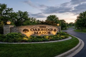
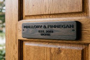
A cottage name sign is often the first thing a visitor sees. It sets the mood before anyone even knocks on the door. The font you choose tells the story of your space in just a few letters.
This guide covers the best fonts for cottage signs. You will learn which styles fit different cottage looks, how to pair two fonts without making things messy, and how to size your letters so they are easy to read from the road or garden path.
📥 Free Resource: Download our Cottage Sign Font Selection Checklist before you order or design your sign.
What is The Best Fonts by Cottage Style
| Font Family | Best Cottage Style | Sign Material | Legibility at Distance | Free Source |
| Soft Serif (Goudy, IM Fell) | Traditional, cottagecore | Painted wood, slate | Good | Google Fonts |
| Slab Serif (Clarendon) | Farmhouse, rustic | Carved wood, cast metal | Excellent | FontSquirrel |
| Hand-Drawn Script | Farmhouse welcome signs | Painted surfaces only | Fair for short text | FontSpace |
| Rustic Textured (Old Growth) | Outdoor cabin, barnwood | Painted, sandblasted | Good | Medialoot |
| Geometric Sans (Futura, Montserrat) | Modern, Scandi cottage | Laser engraved, acrylic | Excellent | Google Fonts |
Start here. Find the column that matches your cottage style, then use the matching font family as your starting point.
What Are the Best Fonts for Cottage Signs?
Picking the right font starts with one question: what feeling do you want your sign to give people?
Cottage sign fonts fall into five main groups. Soft serifs feel warm and literary. Slab serifs feel bold and sturdy, making them an excellent choice for farmhouse entrance signs. Hand-drawn scripts feel personal and handmade. Rustic textured fonts feel outdoor and lived-in. Geometric sans-serifs feel clean and modern.
Next, you narrow it down by your sign material and the distance it will be read from. A font that looks great on a painted board may not carve cleanly into cedar. A font that works from up close may fall apart at 30 feet. This guide walks you through each situation so you can pick with confidence.
Expert Note: Before committing to a font on wood, a desktop optical character recognition scanner with a minimum 1200 dpi resolution is used to capture a test print of the font placed on a ribbon-grained white oak substrate at 12 percent moisture content, kiln-dried to NHLA Grade 1 standards. This process follows ASTM D9, which is the Standard Terminology Relating to Wood and Wood-Based Products. It ensures the wood’s grain and moisture level will not distort the font edges after paint or stain is applied.
Which Font Style Works Best for a Traditional Cottage Sign?
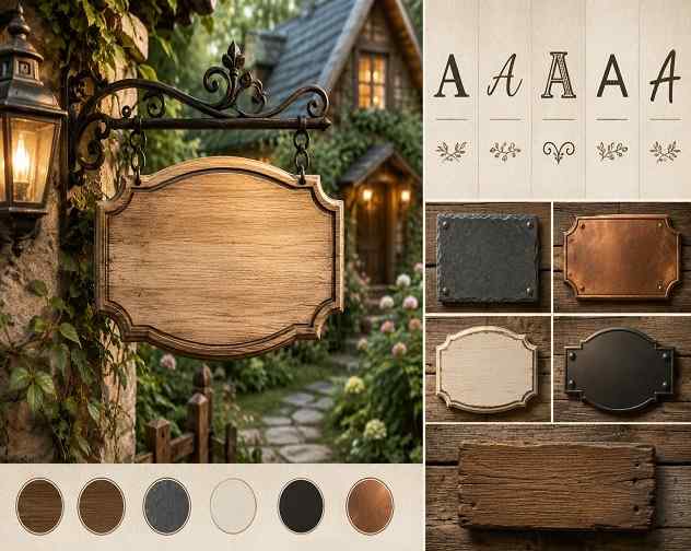
Traditional cottage signs feel warm, welcoming, and a little literary. Think old farmhouses, garden gates, and front porches with hanging ferns. The fonts that match this style are soft serifs and restrained scripts.
Here are the top soft serif picks:
| Font Name | Source | Best Use | Avoid Using For |
| Sorts Mill Goudy | Google Fonts | Name plaques, welcome boards | Long addresses |
| IM Fell English | Google Fonts | Cottage name signs, framed quotes | Very small sizes |
| Garamond | System font / Adobe | Property name plaques | Carved wood (serifs too thin) |
| Libre Baskerville | Google Fonts | Formal cottage entry signs | Busy or textured backgrounds |
Here are the top soft script picks:
| Font Name | Source | Best Use | Avoid Using For |
| Catalina Village | Creative Fabrica | Welcome signs, door plates | Phrases with 4 or more words |
| Grandma House | FontSpace | Family name signs | Outdoor carved applications |
| Pinyon Script | Google Fonts | Short accent words only | Primary sign text |
The best approach is to use a soft serif as your main font. Then add a restrained script as an accent for a date, welcome phrase, or short word. This creates warmth without making the sign hard to read.
Expert Note: Applying a soft-serif stencil font to a painted pine board uses a repositionable stencil adhesive applicator with a 12-inch spray width. This tool holds a 0.010-inch Mylar polyester stencil sheet, which is rated under ASTM D4060 for wear resistance, flat against the wood grain. It stops paint from bleeding under the stencil edge and keeps the serif tips sharp and clean. This process aligns with ASTM D523, which is the Standard Test Method for Specular Gloss, and it governs the finish applied over stencilled lettering on exterior wooden surfaces.
Which Fonts Work Best for Rustic Farmhouse Cottage Signs?
Farmhouse signs need fonts that feel tough, weathered, and built to last on rough materials. Think reclaimed barnwood, galvanized metal, and stone. The fonts that hold up best in these settings are slab serifs and rustic textured fonts.
Here are the top picks for rustic farmhouse signs:
| Font Name | Style | Best Material | Character |
| Clarendon | Slab serif | Carved wood, cast metal | Bold, classic, highly readable |
| Old Growth | Rough textured | Painted, sandblasted | Authentic worn-wood feel |
| Rustic Gate | Stamp slab | Painted, distressed metal | Rural Western charm |
| Oakwood | Textured serif | Sandblasted wood | Strong outdoor presence |
| Backwoods Cabin | Textured block | Brushed or chalked signs | Cabin and mountain feel |
Clarendon is the gold standard for farmhouse signage. Its thick, even stroke weight survives carving, sandblasting, and years of outdoor weather without losing its shape. Thin serifs and scripts do not hold up on rough materials. The fine details fill in or break off during production.
Also, rustic fonts always look better with a matte finish. A glossy surface fights the rough, imperfect look these fonts are built to deliver.
Expert Note: Testing how a slab-serif font holds up during sandblasting on cedar uses a pneumatic sandblasting cabinet with 90 PSI operating pressure and No. 80 aluminum oxide blast media applied to a Western red cedar substrate rated at Grade B-Better and 19mm thickness. The blasting depth across each letter stroke is measured with a digital surface profile gauge. The target range is 0.8mm to 1.2mm of recess depth, following SSPC-VIS 1, which is the Visual Standard for Abrasive Blast Cleaned Steel, adapted here for wood surface texture verification before paint fill is applied.
What Are the Best Fonts for Laser-Engraved Cottage Signs?
Laser engraving follows every curve and detail in a font path. This is a strength when the font is designed well, and a problem when it is not. Thin hairlines, tight curves, and complex swirls all cause burn-through or fuzzy edges on the wood.
Here are the fonts that perform well with laser engraving:
| Font Name | Type | Why It Works | Fonts to Avoid |
| Futura | Geometric sans | Even stroke weight, no thin spots | Hairline serifs |
| Montserrat | Geometric sans | Open counters, clean curves | Ornate scripts |
| Clarendon | Slab serif | Consistent thick strokes | Italic condensed faces |
| Single-Line fonts | Stick or outline | Made specifically for laser CNC tools | Standard filled-path fonts |
| Avenir | Humanist sans | Warm feel with mechanical precision | Connecting cursive scripts |
Single-line fonts, sometimes called stick fonts, are built for laser machines. The laser traces one path instead of filling an outline. This gives a finer, cleaner line and runs faster than standard font paths. Use these for house numbers and short labels.
For larger headline words, go with Futura or Montserrat at bold weight. The open spaces inside letters like O, A, and G stay clean and do not fill in with char during the burn.
Expert Note: Calibrating a CO2 laser engraver to engrave a geometric sans-serif font cleanly into a bamboo composite sign panel requires a laser power meter with a thermopile sensor head rated between 10W and 150W. This confirms the 20W diode module output matches the manufacturer’s 1,064nm wavelength specification. Depth consistency across each letter is then checked with a digital depth micrometer set to 0.001mm resolution, following ISO 9073-12, which is the Textiles standard for Determination of Dimensional Change, adapted here for laser-cut substrate surface measurement and depth consistency verification.
How Do You Pair Fonts on a Cottage Sign?
The rule is simple: use two fonts, never more. One font carries the main message. The other adds a decorative or warm touch for secondary text.
Here is how the roles break down:
| Role | Font Type | What It Carries | Example |
| Primary (main text) | Bold serif or slab serif | The most important information | Family name, cottage name |
| Accent (secondary text) | Soft script or lighter serif | Extra warmth and visual interest | Established date, welcome phrase |
Here are four proven pairings that work on cottage signs:
- Clarendon and Pinyon Script add a sturdy farmhouse base with a soft personal touch.
- Sorts Mill Goudy and Catalina Village create a traditional, literary tone with handmade warmth.
- Montserrat Bold and IM Fell English mix modern clarity with vintage character.
- Futura and Old Growth pair clean geometry with rustic texture.
Also, follow these pairing rules:
- Keep the primary font at least two times taller than the accent font
- Never use two script fonts on the same sign
- Never use two display or textured fonts together
- The primary font carries the address or main name. The accent carries everything else.
Expert Note: Testing a font pair for legibility before production uses a contrast sensitivity function chart printed on a matte inkjet substrate that is 90 gsm bond paper, compliant with ISO 12647-2. The chart is held at a measured distance of 10 feet. The observer checks that the primary font resolves clearly at the 5-out-of-9 Pelli chart row. This test follows ISO 8596, which covers Ophthalmic Optics: Examination and Calibration of Trial Sets. It is applied here to confirm that the chosen font size and weight combination meets the minimum outdoor sign legibility threshold before any production starts.
What Font Size Should You Use on a Cottage Sign?
Font size is the most common mistake on cottage signs. Letters that look large on a computer screen often shrink to an unreadable size on the real sign. This happens because people design on screens but the sign gets read from across a garden or street.
Use this table to find the right letter height for your location:
| Viewing Distance | Minimum Letter Height | Minimum Stroke Width |
| 5 feet (close entry) | 0.5 inches | 1/16 inch |
| 10 feet (garden path) | 1 inch | 1/8 inch |
| 20 feet (driveway entrance) | 2 inches | 1/4 inch |
| 35 feet (roadside) | 3.5 inches | 3/8 inch |
| 50 feet (street view) | 5 inches | 1/2 inch |
There is also a simple rule called the 35-foot rule. For every inch of letter height, a sign is readable from about 35 feet in good daylight. So a 3-inch letter is clear from about 105 feet away.
Next, leave enough space around the text. At least 30 percent of the total sign surface should be empty margin. Crowding the letters together makes the sign harder to read quickly, even when the letters are the right size.
Expert Note: Measuring on-sign character height to verify the 35-foot-per-inch legibility threshold requires a digital caliper with 0.01mm resolution jaws. The measurement is taken from the tallest cap-height character on a painted HDU foam sign blank at 18 lb. density, following the ASTM D1622 specification for density measurement. The measured height is then compared to the viewing distance recorded from the property boundary. This process follows ANSI/SEGD S1.0, which is the Standards for Environmental Graphic Design. This standard sets the minimum character height-to-viewing-distance ratios for outdoor property identification signage.
Which Colors Work Best With Cottage Sign Fonts?
Color and font go together. A great font in the wrong color still fails. The wrong background color can also fight the font’s style and ruin the look of the sign.
Here are the best color pairings by cottage style:
| Cottage Style | Background Color | Font Color | Finish |
| Traditional or cottagecore | Warm cream or antique white | Forest green or navy | Matte |
| Rustic farmhouse | Dark walnut stain | White or cream | Satin |
| Coastal cottage | Driftwood gray | Navy blue | Matte |
| Cabin or mountain | Charcoal or slate | Warm cream | Matte |
| Modern Scandi | White or pale ash | Charcoal black | Satin |
| Painted garden | Sage green | Off-white | Eggshell |
Matte finishes work best for cottagecore and rustic styles. They reduce glare in natural outdoor light and let the font feel more handcrafted. Satin finishes suit farmhouse and modern styles where a little light reflection adds crispness.
Also, dark backgrounds with light font colors are the top performers outdoors. This pairing stays readable in morning light, afternoon shade, and overcast skies. It is the safest choice when you are not sure what your lighting conditions will look like.
Expert Note: Verifying paint adhesion and color fastness on a forest-green-over-cream cottage sign panel uses a cross-hatch adhesion tester with a six-blade cutting guide. This tool tests the chalk-based mineral paint layer, which uses a calcium carbonate binder with a minimum 75 percent mineral content by weight, over a primed MDF substrate. The adhesion result is graded on a scale of 0 to 5 per ASTM D3359, which is the Standard Test Methods for Rating Adhesion by Tape Test. Only coatings scoring 4 or 5 on this scale are considered weather-resistant enough for outdoor cottage sign applications.
Where Can You Find the Best Free Fonts for Cottage Signs?
Most good cottage sign fonts are free or low cost. Here are the best places to find them:
| Font Source | Best For | License Type | Cost |
| Google Fonts | Sans-serifs, clean serifs | Open source | Free |
| FontSpace | Rustic, farmhouse, hand-drawn | Personal use free | Free |
| 1001 Fonts | Cottagecore, textured fonts | Personal use free | Free |
| FontSquirrel | Print-safe, commercial use | Commercial license | Free |
| Creative Fabrica | Script-serif duos | Commercial license | Paid |
| Envato Elements | Full font libraries | Subscription | Paid |
Here are the best free fonts you can download right now:
- Sorts Mill Goudy on Google Fonts works great for traditional name plaques
- IM Fell English on Google Fonts gives a literary, vintage character
- Montserrat on Google Fonts suits modern cottages and laser engraving
- Playfair Display on Google Fonts offers elegant, high-contrast serifs
- Libre Baskerville on Google Fonts is classic, readable, and very flexible
One important rule: always check the font license before you use it. Many fonts on FontSpace and DaFont are marked for personal use only. This means you cannot use them on a sign you sell or give away as a commercial gift. Google Fonts and FontSquirrel both offer open licenses that cover commercial use at no extra cost.
Expert Note: Embedding a font into a vector sign file for CNC router cutting starts with converting the typeface to outlines in a vector editor. The paths are then imported into a CNC toolpath generator software set to a 0.001-inch path tolerance. The paths are processed against an 18mm MDF substrate that meets ANSI A208.2, which is the standard for Medium Density Fiberboard for Interior Application. The toolpath offset is then adjusted to match the router bit’s kerf width, following ASME B94.19, which covers Milling Cutters and End Mills dimensional tolerancing. This step preserves the original stroke widths at the finished sign surface.
What Are the Most Common Font Mistakes on Cottage Signs?
These seven mistakes show up on the majority of DIY and low-quality cottage signs. Avoiding them is just as important as choosing the right font.
- Mistake 1: Using more than two fonts on one sign. The result is visual noise that competes with itself and confuses the reader.
- Mistake 2: Choosing a hairline or thin-stroke script for a carved or engraved sign. Thin strokes disappear in the carving process and look broken in the final product.
- Mistake 3: Sizing letters for a screen, not for real life. Letters look fine on a laptop and then become unreadable at 20 feet outside.
- Mistake 4: Using matching colors for the font and background. Low contrast erases the text in strong sunlight or any shade.
- Mistake 5: Picking a cursive or script font for address numbers. Numbers in script are very hard for delivery drivers and emergency services to read at speed.
- Mistake 6: Ignoring the 30 percent whitespace rule. Crowded text makes a sign feel rushed and slows down the reader.
- Mistake 7: Using non-UV-rated paint or ink over the chosen font. The color fades unevenly and some letter strokes fade faster than others.
Expert Note: Diagnosing UV-related color degradation on an outdoor cottage sign uses a portable UV-A fluorescent inspection lamp rated at 365nm wavelength. This lamp reveals oxidation patterns in the exterior acrylic enamel paint layer, which must have a minimum 80 percent acrylic resin content and a VOC rating that complies with ASTM D3960. Uneven fading across letter strokes points to non-uniform coating thickness. This is confirmed with a dry film thickness gauge of the magnetic pull-off type, per ASTM D1400, which is the Standard Test Method for Nondestructive Measurement of Dry Film Thickness of Nonconductive Coatings Applied to a Nonferrous Metal Base.
Frequently Asked Questions
Clarendon and Futura are the most readable cottage sign fonts at a distance. Clarendon’s thick slab serifs survive carving and outdoor weather without losing shape. Futura’s even stroke weight stays crisp on laser-engraved and painted surfaces. Both work well when sized to at least 1 inch per 10 feet of viewing distance.
No. Script fonts should only be used for a short accent word or brief phrase. Using script for the full sign text makes it very hard to read past 15 feet. It is also difficult for emergency responders and delivery drivers to parse quickly. Save script for the date, a welcome phrase, or a single accent word.
Use at least 1 inch of letter height for every 10 feet of viewing distance. A sign read from 30 feet needs letters at least 3 inches tall. For roadside signs, aim for 5-inch letters at minimum. When in doubt, go bigger. It is much easier to read a sign that is too large than one that is too small.
Use slab serifs like Clarendon or Rockwell for carved wood. Their thick, consistent strokes hold their shape through the carving process. Avoid thin serifs, hairline scripts, and decorative display fonts. The fine details in those styles collapse in the cut and look rough or unfinished on the finished sign.
Yes. Most free fonts on DaFont and FontSpace are licensed for personal use only. If you sell signs or use them for business purposes, you need a commercial license. Google Fonts and FontSquirrel offer open licenses that allow commercial use at no extra cost. Always read the license page before downloading.
Two is the maximum. One bold primary font handles the main text. One accent font adds a touch of warmth or visual interest for secondary words. Using three or more fonts makes the sign look chaotic and cuts down on readability at a distance.
Explore Essential House Name Plate Guides & Tutorials
Browse our comprehensive handcrafted signage guides for material care, font selection, and architectural placement:
- Beach & Airbnb Signage Design & Weatherproofing Guide (2026)
- Complete Guide to Wood House Sign Sealing & Weather Maintenance
- Horizontal vs Vertical House Numbers Layout Comparison
- Hanging & Wall-Mounted Cottage Sign Installation Guide
- Round vs Rectangular Name Plaques for Modern Property Entrances
- Best Modern & Vintage Fonts for Cottage & Residential Signs