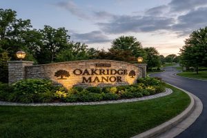
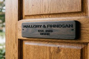
An estate entrance sign is more than a name on a wall. It is the first thing any visitor, delivery driver, or passerby sees at your property. Done well, it communicates quality, permanence, and pride of ownership before anyone reaches your front door, where main door name plates also make a statement. Done poorly, it looks out of place, hard to read, or simply forgettable.
Designing a great estate entrance sign requires three decisions to go right at the same time: the right material for your climate and budget, the correct size for the distance visitors approach from, and a style that fits your home’s architecture. Get all three right and the sign becomes a landmark. Get one wrong and you will want to replace it within a few years.
This guide walks through every aspect of estate entrance sign design from the ground up. By the end, you will know exactly what to order or whether to make it yourself, what size to make it, and what style to choose for your specific property.
📥 Download Free: Print our Estate Entrance Sign Design Checklist PDF and use it as a planning guide before briefing any sign fabricator.
What Is an Estate Entrance Sign and Why Does It Matter?
An estate entrance sign marks the entrance to a private property: a residential estate, farm, villa, heritage property, or gated community. It typically appears on one or both sides of a gate opening, mounted on a stone or brick pillar, set into a freestanding wall, or installed as a standalone monument sign beside the driveway entrance.
Estate entrance signs range from a simple carved stone post with a property name to a fully engineered illuminated monument sign with carved granite panels, cast bronze letters, and integrated landscape lighting.
The reason they matter comes down to first impressions. Property research consistently shows that a well-designed entrance increases the perceived value of the property. Estate agents frequently cite entrance presentation as one of the top three factors that influence a buyer’s first impression when viewing a property listing.
Also, a well-designed sign serves a practical function. Emergency services, delivery drivers, and visitors need to find your property quickly. A clear, well-lit, appropriately sized estate sign makes this possible at any time of day or night.
There is also a security benefit. Properties with clearly marked, professional entrances are less likely to be accessed without permission. A strong entrance presence signals that the property is actively maintained and monitored.
Expert Note: When conducting the pre-installation site survey for a new limestone estate entrance monument sign on a rural driveway approach where the exact location of buried utility services (water, electricity, fibre optic cables) is unknown, a ground penetrating radar (GPR) system with 400MHz centre frequency antenna, 2.5-metre maximum depth penetration, real-time B-scan display, and GPS position tagging is used to scan the proposed foundation excavation zone (typically 1.0 to 2.0 metres square depending on sign size) in a 0.25-metre grid pattern before any mechanical excavation begins. GPR at 400MHz provides resolution adequate to detect 50mm diameter utility pipes and cables at depths up to 1.5 metres in typical clay and loam soils. Any GPR anomalies are marked on the ground surface and must be confirmed by hand excavation before mechanical digging proceeds. Ground penetrating radar survey for buried utility detection follows ASTM D6432-19 (Standard Guide for Using the Surface Ground Penetrating Radar Method for Subsurface Investigation).
What Size Should an Estate Entrance Sign Be?
Sizing is the most technically important decision in estate entrance sign design. A sign that is too small cannot be read from the road. A sign that is too large overwhelms the gate and looks inappropriate.
There are two sizing questions to answer: the size of the overall sign structure (height and width of the monument or panel), and the height of the individual letters.
Letter height: the legibility rule The fundamental rule of outdoor sign legibility comes from visual science. A person with standard 20/20 vision can read letters that are 1 inch (25mm) tall from 10 feet (3 metres) away. This gives a basic ratio of 25mm of letter height for every 3 metres of viewing distance.
However, estate entrance signs face a real-world challenge. Many visitors approach from a moving vehicle at 30 to 60 kilometres per hour. Moving vehicle legibility requires a 40 to 60 percent increase in letter height compared to static viewing. This means the practical formula is:
Minimum letter height (mm) = viewing distance in metres x 10 (for stationary viewing) For a moving vehicle: minimum letter height (mm) = viewing distance in metres x 15
For example: if your gate is set 30 metres back from the road and vehicles approach at 40 km/h, the minimum letter height should be 30 x 15 = 450mm for a clear read. If the gate is at the road edge and visitors approach slowly, 30 x 10 = 300mm is sufficient.
Sign panel sizing The sign panel should be proportional to the gate opening and pillar size. A general rule: the sign panel width should be no more than the width of the gate pillar on which it sits. Also, the text area should fill no more than 40 percent of the total sign panel area. The remaining 60 percent is negative space (plain background), which makes the design look premium and the text legible.
| Driveway Gate Width | Recommended Panel Width | Recommended Panel Height | Min Letter Height (30m approach) |
| Up to 3m (single gate) | 600 to 900mm | 300 to 500mm | 300mm |
| 4 to 6m (double gate) | 900 to 1,500mm | 400 to 700mm | 300mm |
| 6 to 10m (estate gate) | 1,500 to 2,400mm | 600 to 900mm | 400mm |
| 10m or wider (grand entrance) | 2,400mm or wider | 900 to 1,200mm | 500mm |
For most residential estates in India and the UK, a sign panel of 1,200 to 1,800mm wide and 500 to 700mm tall is appropriate for the standard 4 to 6 metre gate opening.
Expert Note: When validating that the proposed estate entrance sign letter height of 150mm will be clearly legible by visitors approaching the gate from the public road 15 metres away in a vehicle travelling at 20 km/h, a Snellen visual acuity chart with Landolt C optotypes at the ISO standard ratio of 5:1 height to stroke width, mounted at the actual road approach viewpoint, with letter sizes scaled precisely to match the proposed sign is used to confirm legibility under the site’s specific lighting and contrast conditions. A person with standard 20/20 (6/6) visual acuity can resolve a Landolt C gap of 1 arc-minute at the test distance. For the proposed 150mm letter height at 15 metres, the letter subtends 34.4 arc-minutes, which is well above the 5-arc-minute minimum for reliable single-letter recognition in clear daylight conditions. Legibility confirmation at design stage using standard optotype methodology follows ISO 8596:2009 (Optics and Optical Instruments: Visual Acuity Testing: Standard Optotype and Its Presentation), the international standard for the determination and specification of visual acuity.
What Materials Are Best for a Large Estate Entrance Sign?
The material you choose defines the tone, quality, and longevity of your estate entrance sign. Each material has a different look, lifespan, maintenance requirement, and cost.
Carved natural stone (granite, sandstone, limestone, slate) Natural stone is the highest-status material for estate entrance signs. It communicates permanence, heritage, and quality in a way no other material can match.
Granite is the most durable option. It is extremely hard, does not absorb water, and resists UV fading permanently. Granite can be polished, honed, or bush-hammered to create different surface textures. Letters are either sand-carved into the granite face or applied as dimensional letters fixed to the granite panel.
Sandstone is softer and more porous than granite. It gives a warmer, more rustic appearance. It carves beautifully with crisp, clean letter edges. However, sandstone in very wet climates absorbs water and can stain or erode over long periods. In sheltered positions and drier climates, sandstone lasts 30 to 50 years.
Limestone sits between granite and sandstone in hardness and porosity. It gives a classic, refined look and carves well. It is also somewhat susceptible to acid rain, which can etch the surface in high-pollution urban areas over time.
Cast bronze and brass plaques Cast bronze is the traditional material for prestige property entrance plaques. Bronze has been used for memorial and estate signage for hundreds of years. It develops a natural patina over time that many owners consider an asset. If you prefer the original gold-tone, apply a clear lacquer after installation and reapply every 5 years.
Brass plaques are less expensive than cast bronze but give a similar initial appearance. The main difference is durability: bronze is an alloy of copper and tin, which is harder and more corrosion-resistant than brass (copper and zinc).
Fabricated dimensional metal letters CNC-routed stainless steel, aluminium, or brass letters mounted proud of a stone, brick, or concrete panel create a high-end three-dimensional effect. The dimensional relief creates shadow and depth that flat engraved or flat painted letters cannot achieve. This is currently the most popular approach for premium estate signs in the UK, India, and Australia.
High-density urethane (HDU) composite HDU is a closed-cell foam that looks like carved wood but never rots, swells, or cracks. It is lighter than stone, very easy to carve with CNC machines, and takes paint and primers extremely well. It gives a premium carved look at a significantly lower weight and cost than natural stone. A well-made painted HDU estate sign lasts 15 to 25 years with minimal maintenance.
Brick and blockwork monument signs Many estate entrances use a brick or concrete block pillar or wall as the structural base, with a natural stone or metal letter panel inset into the face. This gives the visual heaviness and permanence of masonry at a lower cost than a full stone construction.
| Material | Lifespan | Maintenance | Prestige Level | Best For |
| Carved granite | 50-100+ years | Very low | Premium | Heritage, luxury, permanent estates |
| Sandstone | 30-50 years | Low to medium | High | Classic, rural, cottage estates |
| Cast bronze plaque | 50-80 years | Low (patina or lacquer) | Premium | Traditional, heritage properties |
| CNC stainless letters | 30-40 years | Very low | High | Contemporary, modern estates |
| PVDF powder-coated aluminium | 15-25 years | Very low | Medium | Commercial communities, budget premium |
| HDU painted composite | 15-25 years | Medium | Medium | Carved look, budget-conscious |
| Brick + inset panel | 30-50 years | Low | Medium to high | Community entrances, suburban estates |
Expert Note: When testing the compressive strength of concrete cubes from the mix used to construct the estate entrance sign foundation to verify it meets the specified C25/30 strength class (25 MPa characteristic cylinder strength, 30 MPa characteristic cube strength), a hydraulic compression testing machine with 2000kN capacity, automatic load-rate control at 0.6 MPa/second, and digital peak load recording is used to crush 150mm cube specimens cured for 28 days in water at 20 degrees Celsius as required for the standard curing protocol. Three cubes per foundation pour are tested. If any cube falls below 24 MPa (80% of the specified 30 MPa characteristic value) the concrete does not meet the specification and the foundation must be assessed by a structural engineer. Compressive strength testing of hardened concrete follows ASTM C39/C39M-21 (Standard Test Method for Compressive Strength of Cylindrical Concrete Specimens), adapted here for 150mm cube specimens per BS EN 12390-3:2019 (Testing Hardened Concrete: Compressive Strength of Test Specimens).
What Are the Most Popular Style Aesthetics for Estate Entrance Signs?
Style is the visual language of your estate sign. The style should reflect the architecture of the main house, the character of the surrounding landscape, and the impression you want to give to visitors.
There are four dominant style categories for estate entrance signs in 2026.
Classic Heritage This style uses serif typefaces (such as Trajan, Garamond, or Caslon), symmetrical layouts, carved natural stone, gold leaf lettering, and traditional proportions. It communicates history, stability, and old-money confidence. It suits Georgian, Victorian, Edwardian, and heritage-style homes.
Key elements: carved sandstone or limestone panel, serif font, gold or black-painted letters, symmetrical centre composition, flanking stone pillars or piers, formal landscaping with topiary or box hedges.
Modern Minimalist This style uses sans-serif fonts (Helvetica, Futura, Gill Sans), asymmetric layouts, large negative space, matte or brushed metal letters, and very simple structures. It communicates precision, restraint, and contemporary luxury. It suits contemporary, modernist, and new-build homes.
Key elements: dark granite or Corten steel panel, sans-serif font in brushed stainless or white acrylic, halo LED backlighting, asymmetric placement of text, horizontal composition, integrated low landscape planting.
Rustic Country This style uses irregular natural stone (slate, fieldstone, or coursed stone), hand-painted lettering or hand-made ceramic inserts, wrought iron details, and organic non-symmetrical compositions. It communicates authenticity, warmth, and connection to the land. It suits farmhouses, rural retreats, vineyards, and country estates.
Key elements: dry-stone or coursed slate pillar, painted or ceramic name plate set in stone, rustic serif or hand-lettered font, antique iron lanterns or fence posts, native planting.
Contemporary Luxury This style combines premium materials in unexpected ways: dark granite with backlit channel letters, a floating acrylic panel in front of a stone wall, or Corten steel letters weathering to a rich amber tone. It communicates confident originality and investment in quality. It suits architect-designed homes and high-value new developments.
Key elements: Corten steel, dark granite, or blackened brushed steel, premium sans-serif or display typeface, integrated LED channel lighting or halo lighting, architectural landscaping with sculptural plants or water features.
Expert Note: When conducting a pre-design topographic survey of the proposed estate entrance area to capture the exact geometry of the existing gate pillars, wall faces, and ground levels before a new CNC-fabricated stainless steel letter assembly is designed to integrate seamlessly with the existing masonry, a terrestrial LiDAR (Light Detection and Ranging) scanner with 2mm positional accuracy at 50 metres, 360-degree horizontal and 290-degree vertical field of view, and 1,000,000 points per second scan rate is used to create a full 3D point cloud model of the existing entrance structure. The point cloud is imported into CAD software to produce as-built drawings of the masonry with 2mm dimensional accuracy. This eliminates the dimensional errors that occur when site measurements are taken manually with a tape measure, which are typically plus or minus 5 to 10mm over a 3-metre pillar face, and ensures the fabricated letter assembly fits precisely on first installation. 3D terrestrial LiDAR scanning accuracy classification follows ASTM E2544-11a (Standard Terminology for Three-Dimensional Imaging Systems).
How Do You Choose the Right Font and Letter Style for an Estate Sign?
The font choice on an estate sign is as important as the material. The right font makes the text readable, prestigious, and matched to the property style. The wrong font makes it look either illegible or cheap.
The two main font categories for estate signs:
Serif fonts Serif fonts have small decorative strokes (called serifs) at the ends of each letter stroke. Examples include Trajan, Times New Roman, Garamond, and Baskerville. Serif fonts read as traditional, classic, and authoritative. They suit heritage, Georgian, and Victorian-style properties.
For outdoor estate signs, use serif fonts with a clean, open cut. Avoid very thin serif strokes (called hairline serifs) because these do not translate well into carved stone or cast bronze and become illegible at distance.
Sans-serif fonts Sans-serif fonts have no decorative end strokes. Examples include Helvetica, Futura, Gill Sans, and Gotham. They read as clean, modern, and precise. They suit contemporary, minimalist, and new-build properties.
Sans-serif fonts generally offer slightly better legibility at long distances than serif fonts because there are no fine strokes that can blur together.
Font rules for estate signs:
- Use no more than two different fonts on the same sign. One for the property name, one for a subtitle (house number, road name) if needed.
- Avoid script, cursive, or decorative novelty fonts. They look good at close range but become unreadable at 20 metres.
- Letter spacing (kerning) should be generous. Outdoor signs need more space between letters than print design. Add 10 to 20 percent more space than you would for the same font in a printed document.
- Capitalise selectively. ALL CAPITALS works well for estate names of three to five letters. For longer names, use Title Case (First Letter Capitalised) which reads more naturally.
What not to do: Do not mix a serif and a sans-serif font in the estate name itself. Do not use a script font as the main text. Do not use a novelty themed font (Western, Gothic, Celtic knotwork) unless it specifically matches your property’s architectural history.
Expert Note: When assessing the bearing capacity of the ground at the proposed estate entrance monument sign location before the structural engineer specifies the foundation pad dimensions, a plate load tester with 300mm diameter hardened steel bearing plate, calibrated hydraulic jack, reference beam and dial gauge settlement measurement system with 0.01mm resolution is used to perform a static plate load test per ASTM D1195 at the compacted base of the proposed 600mm deep foundation excavation. Load is applied in increments of 25kN up to twice the design bearing pressure (typically 50 to 150 kPa for a 2-tonne stone sign monument), and settlement is recorded at 1-minute intervals at each load stage. A bearing capacity below the design value indicates the soil is too soft and the foundation must be enlarged or deepened. Plate load testing follows ASTM D1195/D1196-93 (Standard Test Methods for Repetitive/Non-Repetitive Static Plate Load Tests of Soils and Flexible Pavement Components for Use in Evaluation and Design of Airport and Highway Pavements), adapted for residential monument sign foundation bearing capacity assessment.
What Are the Best Surface Finishes for Stone and Metal Estate Signs?
The surface finish determines how the sign looks close up, how it handles weathering, and how the letters appear. Here are the most popular finishes for each material.
For natural stone panels:
Sand carved (recessed letters): the letters are recessed into the stone face. This is the most traditional stone carving method. Recessed letters are very durable and resist damage because the letter face is protected below the stone surface. Gold leaf, paint, or a contrasting stone colour can be applied to the letter recess.
Raised (relief) letters: the background is recessed, leaving the letters raised proud of the face. This creates a strong three-dimensional effect but requires significantly more stone to be removed. Raised stone letters are more expensive to produce.
Polished face with sandblasted letters: the stone face is polished to a mirror-smooth finish, and the letters are sandblasted to a matte contrast. This gives a striking visual contrast between the reflective background and the matte letters.
For metal letters and panels:
Brushed finish: the metal surface is ground in one direction to give a fine grain texture. Brushed stainless steel and brushed brass both give a premium, modern appearance that does not show fingerprints as clearly as polished metal.
Polished finish: the metal is buffed to a mirror reflective surface. This looks highly premium but shows fingerprints and water marks easily and requires more maintenance.
PVDF powder-coated: the metal is powder-coated with a PVDF resin in any colour from the RAL chart. This gives 20 to 25 years of colour stability outdoors. It is the most practical finish for aluminium letters in exposed outdoor locations.
Corten steel: allowed to rust in a controlled way, Corten steel forms a stable, rich amber-brown patina that seals the surface against further corrosion. Corten estate letters or panels give a very distinctive, organic, architectural appearance. Note: Corten must be allowed to weather for 3 to 6 months before it stabilises. During this period, orange run-off stains any adjacent stone or concrete.
Gold leaf: real gold leaf (24 carat) applied to recessed stone letters or to the face of a cast bronze plaque gives the most premium, long-lasting gilded finish available. Gold leaf does not tarnish or fade because gold is chemically inert. A properly applied gold leaf finish in a sheltered position can last 25 years before regilding is needed.
Expert Note: When preparing the surface of a sandblasted limestone estate entrance sign panel for the application of gold leaf into the recessed letter channels, to confirm the blast-cleaned letter recess has achieved the correct surface roughness profile (Ra 12.5 to 25 micrometres) that is needed for the gilding adhesive (size) to key into the stone surface, a Testex Press-O-Film surface profile replica tape (coarse grade, 25 to 115 micrometre range) with 0.5 micrometre resolution digital gauge for reading the tape replica thickness is used to measure the surface roughness of three representative letter channels on the completed sandblasted limestone panel. The replica tape is pressed firmly into the letter channel, removed, and its total thickness (including the 50-micrometre film substrate) is measured with the digital gauge. Subtracting the 50-micrometre substrate gives the average surface profile depth. Values below 12.5 micrometre require additional sandblasting. Values above 75 micrometre indicate over-blasting that has opened up the porous limestone surface too much, which will cause excessive size absorption. Surface profile measurement on blast-cleaned surfaces follows ISO 8503-5:2017 (Preparation of Steel Substrates Before Application of Paints and Related Products: Surface Roughness Characteristics of Blast-Cleaned Steel Substrates: Replica Tape Method for the Determination of the Surface Profile), adapted here for sandblasted limestone substrate characterisation.
How Do You Design an Estate Sign That Is Readable From the Road?
Legibility is the performance test that all aesthetic decisions must pass. A beautiful estate sign that cannot be read from the road has failed its primary purpose.
There are five legibility factors to control.
1. Letter height (covered in the sizing section above) Follow the viewing distance formula. Test with a full-scale paper mockup at the actual installation location before ordering the fabricated sign.
2. Contrast The contrast between the letter colour and the background colour is the single biggest factor in legibility. Dark letters on a light background, or light letters on a dark background, provide the strongest contrast. Avoid medium-tone letters on medium-tone backgrounds (for example, natural brass on mid-tone sandstone). The minimum contrast ratio for outdoor sign legibility is 3:1 (measured as luminance contrast).
The highest-contrast combinations for estate signs:
- Gold or white letters on dark grey or black granite
- Black painted letters on cream or buff sandstone
- White-painted or polished chrome letters on dark Corten steel
- Gold leaf letters recessed into dark slate
3. Font weight and stroke width Letter strokes that are too thin become invisible at distance, especially in bright sunlight where the stone or metal surface glares. The minimum stroke width for outdoor estate sign letters is 8 percent of the letter height. For a 150mm letter, the minimum stroke is 12mm. For engraved or sandblasted letters, the minimum depth is 6mm to create enough shadow contrast for legibility.
4. Letter spacing Open letter spacing (also called tracking) dramatically improves legibility at distance. On an outdoor estate sign, the gap between adjacent letters should be at least 20 percent of the letter height. For 150mm letters, this means at least 30mm between letters.
5. Background simplicity The area around the sign text should be plain and uncluttered. Decorative stone texture, busy stone patterns, or multiple graphic elements behind the text all reduce legibility. The sign background should be as simple as possible. This is why a polished granite face reads better than a rough-textured fieldstone face for signage purposes.
Expert Note: When specifying the soil conditions at a proposed estate entrance sign foundation location in order to determine whether the site’s soil chemistry is aggressive enough to corrode the carbon steel rebar in the concrete foundation (requiring epoxy-coated or stainless rebar as a corrosion mitigation measure), a soil resistivity tester using the Wenner 4-electrode pin array with 0.3 to 30 metre electrode spacing, 0.1 ohm-metre resistivity resolution, and frequency-domain measurement at 128Hz is used to measure the soil electrical resistivity at the foundation location to a depth of 0.6 metres (equivalent to the electrode spacing of 0.2 metres). Soil with a resistivity below 10 ohm-metres is classified as highly corrosive to buried steel per BS EN ISO 12944-2. In such soils, epoxy-coated rebar or a cathodic protection system should be specified for the sign foundation rebar. Soil resistivity measurement for buried structure corrosion risk assessment follows ASTM G57-06 (Standard Test Method for Field Measurement of Soil Resistivity Using the Wenner Four-Electrode Method).

What Structural and Foundation Requirements Does a Permanent Estate Sign Need?
A large estate entrance sign is a permanent structure. This means it needs a proper concrete foundation, the correct structural design for wind loading, and in many cases a permit or building consent.
Foundation depth The foundation of an estate sign must be deep enough to prevent frost heave (in cold climates) and to resist the overturning moment from wind loading. The overturning moment is the rotational force that wind pressure on the sign face creates at the base of the sign post or pillar.
A simple rule for freestanding signs: the foundation depth should be at least 60 percent of the sign height above ground, with a minimum depth of 600mm.
For example: a sign pillar that stands 1.5 metres above ground needs a foundation at least 900mm deep. A 2.0 metre pillar needs at least 1,200mm of foundation depth.
The foundation should be concrete (minimum C25 strength class), reinforced with 12mm steel rebar, and poured into a formed excavation or in-situ into a correctly sized hole.
Wind load All freestanding signs are subject to wind pressure. The wind pressure on a flat sign panel is calculated based on the local wind speed and the panel area. In most residential locations in India and the UK, the design wind speed is 35 to 50 metres per second for a 1-in-50-year storm event.
The sign structure (posts, pillars, welds, and foundation) must all be designed to resist the wind overturning moment with a safety factor of at least 2.0. For large estate signs (over 2 square metres in panel area), a structural engineer should check these calculations.
Sign post specifications For freestanding metal-posted signs: use minimum 100mm x 100mm x 5mm wall square hollow section (SHS) steel posts in Grade 316 stainless steel or hot-dip galvanised mild steel. Embed the posts at least 700mm into the concrete foundation.
Waterproofing at the base Where sign posts enter the ground, water can track down the post and into the foundation, causing corrosion of the embedded section. Seal the post-to-ground interface with waterproof flashing tape and a bead of neutral-cure silicone sealant. This prevents water ingress even in very wet climates.
Expert Note: When checking that the concrete mix being placed for an estate entrance sign foundation has the correct workability (flow and consistency) to fill the reinforcement cage and formwork without voids, before the concrete sets, a Abrams slump cone test kit with 300mm tall frustum of cone, 100mm top diameter, 200mm base diameter, tamping rod, and base plate is used to measure the concrete slump of each truckload or batch of concrete delivered to site. The test is conducted within 5 minutes of discharge from the mixer. A target slump of 75 to 100mm is specified for lightly reinforced foundations in mild exposure conditions. Concrete with a slump below 50mm is too stiff to compact properly around the rebar. Concrete with a slump above 180mm is too wet and will produce a weaker, more porous concrete when cured. Concrete workability measurement follows ASTM C143/C143M-20 (Standard Test Method for Slump of Hydraulic-Cement Concrete), the primary workability test for all fresh concrete in construction.
How Do You Light an Estate Entrance Sign for Maximum Impact?
Lighting transforms an estate entrance sign after dark. An unlit sign becomes invisible at night. A well-lit sign becomes a landmark that conveys warmth, quality, and welcome to anyone approaching the property.
There are four main lighting approaches for estate entrance signs.
Ground-mounted uplighters Narrow-beam LED spotlights buried in the ground in front of the sign panel project light upward across the sign face. This grazing light creates shadow across any carved lettering, making the three-dimensional depth of the text dramatically visible at night.
For the best effect, uplighters should be positioned 300 to 500mm in front of the sign panel and aimed at an angle of 30 to 45 degrees to the sign face. This angle maximises shadow play in the carved or dimensional letters.
Also, use 3000K warm white LED uplighters for stone signs. This warm colour temperature makes sandstone, limestone, and granite glow with a golden, welcoming tone. For contemporary dark granite with stainless letters, 4000K neutral white gives a crisper, more architectural look.
Halo backlighting (for dimensional letters) For dimensional metal letters mounted proud of the panel surface, LED strip lighting mounted between the letters and the panel face illuminates the wall behind each letter with a halo of light. This is the most striking and contemporary lighting effect for estate signs. It is visible from a great distance and communicates premium quality clearly.
Solar-powered lighting Solar-powered LED uplighters are increasingly used for estate entrance signs in locations where running a buried mains cable to the entrance is impractical or expensive. A properly specified solar panel and battery system can power two 5-watt LED uplighters for 8 to 10 hours per night from a single day’s solar charging, even in overcast conditions.
For reliable year-round performance, the solar panel should be rated at a minimum of 20 watts, and the battery should provide at least 3 days of stored energy to cover cloudy periods without recharge.
Mains-powered buried conduit For permanent, highly reliable estate sign lighting, run a 25mm diameter armoured cable in a buried duct from the property’s main electrical supply to a weatherproof junction box near the sign. From this box, connect to the sign uplighters with 1.5mm2 twin-and-earth outdoor cable. This is the most reliable long-term option and allows the use of smart timers, motion sensors, and dimming controls.
| Lighting Method | Running Cost | Reliability | Best For |
| Solar LED uplighter | Zero | High (battery backup) | Remote entrances, no mains cable |
| Mains LED uplighter | Low | Highest | Permanent estates with mains access |
| Halo LED backlit letters | Low | High | Contemporary luxury signs |
| Low-voltage landscape system | Very low | High | Integrated landscape schemes |
| No lighting | Zero | None | Not recommended for any permanent sign |
Expert Note: When specifying the beam angle of the LED landscape uplighter to be used to illuminate the 600mm wide by 400mm tall carved sandstone estate entrance sign panel from a ground-mounted position 400mm in front of the panel, to confirm the beam will fully cover the sign face without excessive spill light onto the adjacent gate pillar or driveway surface, a goniophotometer (rotary goniophotometer) with 0.1-degree angular resolution, calibrated photocell array, and automated 2-axis rotation system is used to measure the candela distribution curve and beam angle of the proposed LED uplighter in a darkened laboratory setting. The beam angle (the angle between the two points at half the peak intensity, also called the 50 percent intensity angle) should be between 10 and 20 degrees for a narrow-beam sign uplighter. An excessively wide beam (above 30 degrees) causes light trespass onto the gate pillar and pavement that dilutes the sign impact. The goniophotometric candela distribution data is modelled in DIALux evo lighting simulation software to predict the final lux distribution on the sign face before purchasing. Goniophotometric measurement of luminaires follows the test method in IES LM-75-19 (Goniophotometer Types and Photometry Guide), published by the Illuminating Engineering Society.
How Do You Match Your Estate Sign to Your Gate and Fencing Style?
The estate entrance sign does not stand alone. It is part of a designed entrance system that includes the gate, gate pillars, fencing or walls, planting, and driveway surface. When all these elements work together visually, the entrance looks intentional and high-quality. When they conflict, the entrance looks assembled from separate decisions without a connecting idea.
Five integration principles:
Principle 1: Match the primary material. If your gate is black powder-coated wrought iron, the sign letters or frame should be black powder-coated metal, not warm brass. If your gate is warm-tone timber, a sandstone or carved oak sign works better than cold stainless steel.
Principle 2: Echo the font personality. A gate with traditional curved ironwork and ornate details needs a serif or traditional font on the sign. A gate with straight, geometric steel panels and minimal ornamentation needs a clean sans-serif font on the sign.
Principle 3: Match the scale. A large 4-metre wide gate with 400mm diameter pillars needs a sign panel of at least 1,200mm wide. A small 1.8-metre pedestrian gate with 250mm pillars needs a sign panel of no more than 600mm wide. Proportion between the sign and the gate structure is the visual test.
Principle 4: Coordinate the lighting. If your gate has electric lanterns or LED post lights, the sign lighting should match in colour temperature (3000K or 4000K) and style. Mixing a warm lantern-style gate light with a cold LED spotlight on the sign creates a jarring visual mismatch.
Principle 5: Include the planting. Landscape planting at the entrance frames the sign and gate. Low, formal planting (box hedging, clipped yews, standard topiary) frames a classic entrance. Architectural grass planting (agapanthus, ornamental grasses, lavender) frames a contemporary entrance. Soft, romantic planting (roses, wisteria, cottage flowers) frames a rural or country entrance. Choose planting that fits the overall style, not just what grows best in your local soil.
Expert Note: When evaluating whether the electromagnetic rebar cage installed inside the estate entrance brick pillar is covered with the minimum 40mm of concrete cover as specified by BS EN 1992-1-1 (Eurocode 2) for exposure class XC3 (moderate humidity), before the brick facing is laid around the concrete core, a digital electromagnetic concrete covermeter with 60mm penetration depth, 0.5mm cover display resolution, and dual-frequency operation at 10kHz and 100kHz for rebar diameter discrimination is used to scan the concrete core surface in a 100mm grid pattern. Readings below 35mm indicate insufficient cover that risks early carbonation-induced rebar corrosion in the brick pillar core. Any zone with cover below 35mm is remediated by removing the affected concrete and recasting. Concrete covermeter operation and calibration follows BS 1881-204:1988 (Testing Concrete: Recommendations on the Use of Electromagnetic Covermeters), the UK standard for non-destructive cover measurement in structural concrete elements.
What Are the Rules and Permits Required for an Estate Entrance Sign?
Before ordering your estate entrance sign, check the planning rules and permit requirements for your location. These vary significantly by country, state, and local authority.
In the United Kingdom: Most estate entrance signs for private residential properties are permitted development (no planning permission needed) provided: the sign is on the boundary wall or gate of the property, it is non-illuminated, and it does not exceed 0.3 square metres in total area. Signs larger than 0.3 square metres, illuminated signs, and signs in a Conservation Area or Area of Outstanding Natural Beauty (AONB) require planning consent.
In India: Planning approval for estate entrance signs is governed by the local Municipal Corporation or Gram Panchayat. Most residential areas require a No Objection Certificate (NOC) for any permanent structure at the property boundary. Gated community developments require society or developer approval for entrance sign changes.
In Australia: Each state has different planning requirements. In most residential zones in New South Wales, Queensland, and Victoria, a small estate entrance sign (under 1 square metre, non-illuminated) is exempt development. Larger or illuminated signs require a development application.
Universal rules that apply almost everywhere:
- The sign must be within the boundary of your own property. It cannot project onto a public footpath, pavement, or road.
- Do not obstruct vehicle sightlines at the road junction. A sign that blocks the view of approaching traffic at the driveway exit is a safety hazard and will be required to be removed.
- All electrical work for illuminated signs must be carried out by a licensed electrician and comply with local wiring regulations.
Always check with your local authority before construction begins. Removing a built sign due to a planning refusal is expensive and avoidable.
Expert Note: When evaluating the flexural (bending) strength of a 50mm thick cast sandstone panel to be used as the main face panel of an estate entrance sign, to confirm it can withstand the lateral wind pressure of a 40 m/s design wind event without fracturing, a four-point bending flexural test machine with 50kN actuator capacity, 300mm inner span, 100mm outer span extension per side, and 1mm/min loading rate is used to test three 300mm x 100mm x 50mm sandstone specimens cut from the same casting batch. The modulus of rupture (MOR) must exceed 4 MPa for the panel to carry the calculated bending moment from the specified wind load with a 2.0 safety factor. Sandstone MOR values below 2.5 MPa indicate too high a porosity or clay content in the stone, and the batch must be rejected. Four-point flexural strength testing of dimension stone follows ASTM C880/C880M-18 (Standard Test Method for Flexural Strength of Dimension Stone), the primary standard for structural stone panel qualification.
What Does It Cost to Design and Build a Custom Estate Entrance Sign?
Estate entrance sign costs vary enormously depending on material, size, complexity, lighting, and fabrication quality. Here is a realistic guide for 2026 pricing in GBP (UK) and INR (India).
Budget tier (HDU composite or brick with painted metal letters): GBP 800 to 2,500 / INR 80,000 to 250,000 This covers a professionally designed and fabricated composite or simple brick monument sign with powder-coated aluminium or CNC-routed letters. Suitable for housing societies, small residential estates, and farm entrances.
Mid-range tier (sandstone or limestone with cast bronze or stainless letters): GBP 2,500 to 7,000 / INR 250,000 to 700,000 This covers a hand-carved or CNC-carved natural stone panel with quality metal letters and basic uplighting. Suitable for private residences, boutique gated developments, and heritage farm entrances.
Premium tier (granite monument with cast bronze letters and integrated solar lighting): GBP 7,000 to 20,000 / INR 700,000 to 2,000,000 This covers a fully engineered stone monument sign with structural foundation, cast bronze letters, gold leaf details, and integrated solar or mains LED uplighting. Suitable for luxury estates, heritage properties, and high-value gated communities.
What drives the cost up:
- Larger panel size (more stone, more letters, heavier foundation)
- More complex fabrication (dimensional letters, halo lighting, carved relief work)
- Remote location (access and delivery costs for heavy stone panels)
- Bespoke design (one-off versus standard designs)
- Premium materials (granite versus sandstone, cast bronze versus powder-coated aluminium)
What reduces the cost:
- Brick or block monument base (instead of solid stone)
- Flat-routed acrylic or aluminium letters (instead of dimensional or cast letters)
- Standard panel sizes (versus bespoke cut dimensions)
- No lighting (though this is rarely recommended for a permanent installation)
Expert Note: When commissioning a solar-powered LED uplighter system to illuminate an estate entrance sign in a rural location with no mains electrical supply, after the system has been installed and connected, a photovoltaic I-V curve tracer with 0.1% power measurement accuracy, 100-watt maximum measurement range, temperature-corrected STC (standard test condition) output calculation, and Bluetooth data output is used to measure the actual maximum power output (Pmax) of the installed 30-watt monocrystalline solar panel under the ambient irradiance conditions at the time of commissioning. The measured Pmax is corrected to STC (1000 W/m2, 25 degrees Celsius) using the irradiance and temperature sensor data logged simultaneously. A corrected Pmax within 5% of the rated 30-watt specification confirms the panel is performing correctly. Corrected Pmax values more than 10% below rating indicate a potential installation fault (partial shading, incorrect orientation, or module damage) that must be resolved before commissioning sign-off. Solar panel power output measurement follows IEC 60904-1:2020 (Photovoltaic Devices: Part 1: Measurement of Photovoltaic Current-Voltage Characteristics).
How Do You Maintain an Estate Entrance Sign to Keep It Looking New?
A premium estate entrance sign is a long-term investment. The right maintenance approach can double the time between refurbishments and keep the sign looking new for 20 or more years.
For natural stone signs: Clean twice a year with a gentle pH-neutral stone cleaner. Never use acidic cleaners (vinegar, lemon, hydrochloric acid) on limestone or sandstone. Acid dissolves the calcium carbonate in these stones and etches the surface permanently.
Apply a penetrating stone sealer every 3 to 5 years. This reduces water and stain absorption. For carved recessed letters with paint or gold leaf fill, check the fill annually for any lifting or peeling at the edges and re-fill as needed.
Also, keep plants and ivy trimmed back from the sign face. Ivy roots can enter very fine cracks in stone and cause damage over time.
For metal signs (stainless steel, aluminium, powder-coated): Wipe the surface with a damp soft microfibre cloth and mild pH-neutral detergent every 2 to 3 months. Rinse with clean water. Once a year, apply a thin coat of automotive paste wax to add hydrophobic protection.
For cast bronze plaques: If you want to maintain the original bright gold tone, re-lacquer the bronze every 5 years. Clean first with a soft cloth, then apply a fresh coat of bronze lacquer rated for outdoor use.
If you prefer the natural patina (the greenish-blue verdigris that develops on bronze), simply clean the surface annually with a soft cloth and water. Do not apply lacquer or wax. The patina is chemically stable and protects the bronze underneath.
For gold leaf lettering: Gold leaf is highly durable in sheltered positions. In an exposed position, the gilding adhesive (size) can lift over 10 to 15 years, causing the gold leaf to flake away. A professional regilder can restore the gold leaf by cleaning the recess, applying fresh size, and laying new gold leaf. This is specialist work that should only be carried out by a qualified gilder.
For LED lighting: Clean the LED uplighter lenses every 6 months. Road dust, pollen, and insect deposits on the lens reduce light output by up to 20 percent. Wipe with a damp cloth. Also, check the solar panel glass quarterly and wipe clean with a damp cloth, as dust on the panel surface reduces charging efficiency.
Expert Note: When commissioning a new estate entrance sign with an embedded K-type thermocouple sensor to monitor the thermal cycling experienced by the carved limestone panel across seasons (critical for predicting thermal stress cracking in the stone over the long term), a 4-channel K-type thermocouple data logger with 0.1 degree Celsius temperature resolution, 12-month internal memory logging at 15-minute intervals, USB data export, and battery-powered operation for 18 months is used to record the panel surface temperature at four positions (top face, bottom face, shaded recess, exposed face) simultaneously over a full 12-month measurement period. The maximum seasonal temperature differential at the panel surface (the difference between the summer peak and winter minimum) determines the thermal stress range in the stone. Limestone with a thermal expansion coefficient of 8 to 10 microstrain per degree Celsius experiences significant stress if the seasonal temperature range exceeds 50 degrees Celsius. Temperature cycling beyond this range requires an expansion joint in the mortar bedding. Thermocouple data acquisition follows calibration specifications in ASTM E230/E230M-17 (Standard Specification for Temperature-Electromotive Force (EMF) Tables for Standardized Thermocouples).
🛍️ Design Your Estate Sign: Browse our Custom Carved Stone Entrance Signs, Cast Bronze Estate Plaques, CNC Stainless Letter Sets, and our full Estate Sign Design Service. All projects include a site assessment, 3D design proof, and fabrication guarantee.
Frequently Asked Questions About Estate Entrance Sign Design
What is the standard size for an estate entrance sign?
For most private residential estate entrances with a 4 to 6 metre gate opening, the ideal sign panel is 1,200 to 1,800mm wide and 500 to 700mm tall. The letter height should be calculated at 10mm per metre of approach distance for a stationary viewer, or 15mm per metre for a viewer in a moving vehicle. Always test with a full-scale cardboard mockup at the site before ordering the fabricated sign.
What is the best material for a permanent outdoor estate sign?
Carved granite is the most durable and long-lasting material for outdoor estate signs. It requires virtually no maintenance and lasts 50 to 100 years or more. Sandstone is the most traditional and gives the warmest appearance but requires slightly more maintenance in wet climates. For a more affordable option with a premium look, a brick or concrete monument base with CNC-cut stainless steel or powder-coated aluminium letters is the best value combination.
Do I need planning permission for an estate entrance sign in the UK?
In most UK residential areas, a small non-illuminated sign (under 0.3 square metres) at a property boundary is permitted development. Signs larger than 0.3 square metres, illuminated signs, and any sign in a Conservation Area or listed building curtilage require planning consent from the local planning authority. Always check with your local council before building.
How deep should the foundation be for an estate sign?
As a practical rule, the foundation depth should be at least 60 percent of the sign height above ground, with a minimum of 600mm. For a sign structure 1.5 metres tall, the foundation should be at least 900mm deep. In areas with clay soils or frost risk, increase this depth by 20 percent. All foundations should use minimum C25 strength concrete with 12mm steel rebar reinforcement.
What font works best for a luxury estate entrance sign?
For a classic or heritage style, use a clean-cut serif font: Trajan, Baskerville, or Adobe Garamond are excellent choices. For a contemporary or minimalist style, use a geometric sans-serif: Futura, Gill Sans, or Optima work very well at large outdoor sign scales. Avoid script or cursive fonts for the main property name. They are illegible at distance and do not translate well into carved stone or cast metal.
How much does it cost to carve letters into granite for an estate sign?
Sandblasted or CNC-carved letters in granite typically cost GBP 80 to 200 per letter depending on letter size, depth of carving, and stone hardness. A six-letter property name in 100mm tall letters costs approximately GBP 500 to 1,200 for the carving alone, plus the cost of the granite panel, base, and installation. Adding gold leaf fill to the letters adds approximately GBP 15 to 30 per letter.
Can I use solar lighting for my estate entrance sign?
Yes. A 20 to 30 watt monocrystalline solar panel with a 20Ah lithium battery and two 5-watt LED uplighters provides reliable year-round illumination for most estate entrance signs in the UK, India, and Australia. The system works effectively even in overcast conditions and provides 8 to 10 hours of sign illumination per night. Solar is particularly valuable when the entrance is remote from the property’s mains electrical supply, as it avoids the cost of digging a cable trench.
How do I keep gold leaf letters on my stone sign from peeling?
Gold leaf adheres to a gilding adhesive called gold size. In sheltered positions, gold size remains flexible and adhesive for 15 to 25 years. In exposed positions with direct rain and strong UV, it begins to fail after 8 to 12 years. To extend the life, apply a clear UV-resistant lacquer over the gold leaf immediately after gilding. This seals the gold leaf against moisture and UV without significantly reducing its reflective appearance. When the gold leaf eventually needs renewing, a professional gilder can clean the old size from the letter recess and re-lay fresh gold leaf.
What is the 40/60 rule for estate sign design?
The 40/60 rule states that the text area should fill only 40 percent of the total sign panel area, leaving 60 percent as plain background (negative space). This gives the sign a premium, uncluttered appearance and makes the text significantly more readable at distance. Signs that fill 70 to 80 percent of their panel with text look crowded and communicate low-cost design. Luxury signs use generous negative space as a design element in its own right.
How do I test my sign design for road legibility before fabrication?
Print the design at full scale on paper or card and mount it temporarily at the planned sign location. Then walk or drive away from the sign to your expected viewing distance (the distance from the road or driveway approach). Check that: the estate name is readable at that distance, the font and letter height are sufficient, the contrast between letters and background is adequate in both strong sunlight and overcast conditions, and the scale looks correct relative to the gate and pillars. Make any adjustments to the design based on what you see. This test costs almost nothing and reliably identifies legibility or scale problems before the fabricated sign is ordered.
Explore Essential House Name Plate Guides & Tutorials
Browse our comprehensive handcrafted signage guides for material care, font selection, and architectural placement:
- Beach & Airbnb Signage Design & Weatherproofing Guide (2026)
- Complete Guide to Wood House Sign Sealing & Weather Maintenance
- Horizontal vs Vertical House Numbers Layout Comparison
- Hanging & Wall-Mounted Cottage Sign Installation Guide
- Round vs Rectangular Name Plaques for Modern Property Entrances
- Best Modern & Vintage Fonts for Cottage & Residential Signs