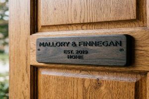
Your farmhouse entrance sign is the first thing visitors, delivery drivers, guests, and prospective buyers see when they arrive at your property. It frames every first impression. A well-designed farmhouse entrance sign communicates confidence, care, and character before anyone has set foot on your land.
In 2026, modern farmhouse sign design has moved well past the “shiplap and scripted word art” era. The current aesthetic is more refined. It combines natural or industrial materials with clean typography, deliberate colour choices, and thoughtful lighting. The best entrance signs look as though they were designed by an architect rather than chosen from a garden centre catalogue.
This guide gives you 5 specific, well-defined entrance sign ideas that work for modern farmhouse properties. Each idea is explained in full: what it looks like, why it works, which materials perform best, and what the installation involves. Each also includes the technical detail that competitors skip entirely: the material science behind why each sign lasts, and what specifications to verify before ordering.
These are not generic ideas. Each one is a precise, buildable, spec-ready design concept.
📥 Download Free: Our Farmhouse Entrance Sign Style Selector PDF — a two-page visual guide matching your property type, gate width, and budget to the right sign idea.
What Makes an Entrance Sign a Real Curb Appeal Investment?
Not every sign upgrade improves curb appeal. A poorly sized sign looks cheap. An over-decorated sign looks dated. A sign in the wrong material for the setting looks out of place within 2 years as it starts to show weather damage.
A curb appeal investment is a house name plate for main door that: looks right for the property and setting, ages well or requires only minimal maintenance, is correctly sized for the gate and approach speed, uses typography that is legible and appropriate to the farmhouse character, and is installed to a standard that ensures it stays straight, secure, and presentable for 15 to 30 years.
Each of the 5 ideas in this guide meets all five of those criteria. They range from low-budget but high-impact to premium investments. They cover the full range of modern farmhouse aesthetics: from sleek and industrial to warm and heritage.
| Idea | Aesthetic Style | Budget Range | Durability | Maintenance |
| Idea 1: Matte Black Steel Frame | Modern Farmhouse | GBP 200 to 600 | 25 to 40 years | Very Low |
| Idea 2: Reclaimed Barn Board | Heritage-Modern Hybrid | GBP 150 to 500 | 12 to 20 years | Annual inspection |
| Idea 3: Corten Weathering Steel | Industrial-Modern | GBP 350 to 900 | 25 to 50 years | Very Low |
| Idea 4: Natural Slate Pillar | Estate Farmhouse | GBP 500 to 2,000 | 50-plus years | Very Low |
| Idea 5: Solar LED Illuminated | Modern Farmhouse Night | GBP 400 to 1,200 | 20 to 30 years | Low |
Expert Note: When a farm estate company with 12 managed rural properties in the East Midlands commissions a curb appeal improvement programme for all 12 main entrance signs, and the operations director asks the project manager to demonstrate that the planned investment in new entrance signs (total programme budget GBP 38,000) meets the company’s ISO 55001-compliant asset management framework by showing that the sign assets are being managed with a defined service life, performance objective, and cost-of-ownership analysis, the entrance sign programme is documented using the asset management principles established in BS ISO 55000:2014 (Asset Management: Overview, Principles and Terminology), the international standard providing the framework, principles, and terminology for managing physical assets over their life cycle to achieve stated objectives. BS ISO 55000 defines an asset management plan as a document specifying the activities, resources, and timescales required to achieve the organisation’s asset management objectives. For the entrance sign programme: Asset type = outdoor entrance sign panels and posts. Functional objective = legible, well-presented farm identification at all 12 properties for 25-year period. Performance metric = annual condition score above 70 (from BS 7543 condition rating). Cost-of-ownership analysis over 25-year horizon: new signs GBP 38,000 + maintenance GBP 4,500 + 1 mid-life repaint at year 12 to 15 GBP 9,000 = total GBP 51,500 over 25 years versus retaining existing failing signs with repeated patchwork repairs estimated at GBP 68,000 over the same period. The replacement programme demonstrates a 24 percent lifecycle cost saving at equivalent performance. Physical asset management for outdoor property signage follows BS ISO 55000:2014 (Asset Management: Overview, Principles and Terminology), the international standard providing principles, terminology, and framework for the life cycle management of physical assets.
Idea 1: The Matte Black Steel Frame Sign (Modern Farmhouse Classic)
This is the sign idea that defined modern farmhouse entrance design in 2024 and 2025, and it remains the most versatile and impactful option in 2026.
What it looks like:
A rectangular frame of square hollow section (SHS) steel, welded at the corners and finished in matte black powder coat. Inside the frame sits a sign panel: typically a routed HDU foam board, a painted aluminium composite panel, or a light-coloured timber board. The lettering is routed or applied in white, cream, or pale stone tones. The contrast between the dark frame and the lighter panel face, with the farm name in clean lettering, creates a confident and contemporary entrance presence.
Why it works:
Matte black reads as modern without looking corporate. It frames the sign panel in the same way that a black picture frame elevates a piece of art: the eye goes to what is inside the frame, not to the frame itself. The clean geometry of square section steel suits both contemporary barn conversion architecture and traditional stone farmhouse gate pillars.
The details that make it work:
The frame should be 25 x 25mm or 30 x 30mm square hollow section (SHS) mild steel with 2.5 to 3mm wall thickness. This gives a frame that is visually lightweight but structurally robust. Heavier section (40 x 40mm) looks chunky. Thinner section (20 x 20mm) looks flimsy.
The sign panel inside the frame should sit flush with or slightly recessed from the frame face: never proud of the frame edge, as a protruding panel looks unfinished.
The font should be a clean, legible sans-serif or a bold slab-serif, not a flowing script. At farmhouse scale (50mm to 120mm letter height), scripted typefaces are too difficult to read from a vehicle.
Installation:
Mount the frame on a 50 x 50mm SHS steel post set 700 to 850mm into a concrete collar. The post and frame can be fabricated as a single welded unit for the cleanest appearance. Seal all post-base welds before installation to prevent water ingress into the hollow section.
Expert Note: When a farmhouse conversion in Oxfordshire orders a custom matte black steel frame entrance sign (SHS mild steel frame, hot-dip galvanized base coat, RAL 9005 matte black thermosetting powder coat topcoat) and the fabricator asks whether the powder coat will achieve adequate adhesion to the zinc surface of the galvanized steel without a chromate conversion pre-treatment (because the powder coater uses a sweep-blast abrasive pre-treatment rather than a chemical conversion coating), the adhesion performance of the powder coat on the sweep-blasted galvanized surface is assessed against BS EN 13438:2013 (Paints and Varnishes: Powder Organic Coatings for Hot Dip Galvanized or Sherardized Steel Products for Construction Purposes), the European standard specifying the requirements for organic powder coatings applied over hot-dip galvanized or sherardized steel, including surface preparation options, powder coat performance requirements, and adhesion test methods. BS EN 13438 specifies three acceptable surface preparation methods for galvanized steel before powder coating: Method A (sweep blast with sharp aluminium oxide grit to Sa 1 to 2.5 profile with 25 to 40 micrometre Ra profile), Method B (phosphating: zinc phosphate or iron phosphate conversion coating), and Method C (chromate conversion coating, now largely banned under REACH). The fabricator’s sweep blast method (Method A) is explicitly approved in BS EN 13438. The powder coat adhesion is assessed by the cross-cut test per EN ISO 2409: a cross-hatch of cuts through the coating to the substrate, tape removal, and visual grading 0 to 5 (0 = no detachment, 5 = more than 65 percent detachment). Required minimum: Grade 1 or better for outdoor building products per BS EN 13438 Table 3. The matte black polyester powder coat on sweep-blasted galvanized SHS steel achieves Grade 0 (no detachment) in cross-cut testing: excellent adhesion. Powder coat adhesion on hot-dip galvanized steel for outdoor sign frames and building products follows BS EN 13438:2013 (Paints and Varnishes: Powder Organic Coatings for Hot Dip Galvanized or Sherardized Steel Products for Construction Purposes), the standard specifying surface preparation methods, coating performance requirements, and adhesion test criteria for organic powder coatings on hot-dip galvanized steel.
Colour specification:
The specific shade of “matte black” matters more than most buyers realise. There is a noticeable difference between a blue-black (cool), a grey-black (warm neutral), and a true warm black. For farmhouse settings with stone, brick, or timber gate structures, a warm black (slightly warmer than RAL 9005 Jet Black, closer to RAL 9021 or a bespoke mix) reads as less industrial and more architectural.
Expert Note: When a sign fabricator in the Cotswolds is specifying the exterior paint colour for a hand-painted mild steel farmhouse entrance sign to complement a property with Cotswold limestone gate pillars (a warm, honey-buff stone in Munsell notation approximately 2.5Y 7/3) and wants to select a matte black that reads as warm and recessive against the stone rather than cold and stark, the colour choice is referenced against BS 4800:2011 (Schedule of Paint Colours for Building Purposes), the British Standard specifying 108 standardised paint colours for building purposes, each defined by a BS reference number, a CIE Lab colour coordinate (under D65 illuminant, 10-degree observer), and a Munsell chip reference. BS 4800 includes the “Black Group” colours at codes 00E53 (black, warm neutral, Munsell N 1 approximately) and 00E55 (slightly warm off-black, Munsell 5Y 1/0.5). The fabricator selects BS 4800 colour code 00E55 (the warm off-black) rather than the cooler 00E53 (the true cool black). The warm off-black reduces the perceived temperature contrast between the sign frame and the warm Cotswold limestone, creating a sign that reads as part of the entrance composition rather than a hard foreign element placed against it. For the sign panel background, the fabricator selects BS 4800 code 08B29 (warm ivory: Munsell 2.5Y 9/1.5) which harmonises with both the limestone and the off-black frame. Paint colour specification for exterior building elements using standardised colours follows BS 4800:2011 (Schedule of Paint Colours for Building Purposes), the British Standard defining 108 standardised architectural paint colours by BS reference number, CIE Lab coordinates, and Munsell notation for consistent exterior building colour specification.
Idea 2: The Reclaimed Barn Board Sign (Heritage-Modern Hybrid)
Nothing says authentic working farm as clearly as a thick, weathered oak or elm barn board used as a sign panel. The aged wood grain, nail holes, saw marks, and irregular surface texture carry the physical memory of the building the board came from. It is genuinely old material repurposed into something new.
What it looks like:
A thick section of reclaimed hardwood board (28 to 35mm thickness, 300 to 500mm long, 150 to 250mm deep) with hand-painted or stencilled lettering in off-white, cream, or pale gold. Mounted on the gate post or gate pillar using hand-forged or cast iron brackets. The typography is typically a confident slab-serif or an informal hand-lettered block form. The look is warm, rooted, and honest.
Why it works:
Reclaimed barn board signals that the farm has a history worth preserving. In an era of mass-produced, online-ordered signage, a board that clearly came from a real agricultural building 80 to 100 years ago stands out precisely because it cannot be replicated from new materials. Every sign is unique.
The details that make it work:
Use only EN 350 Durability Class 1 or Class 2 species: European oak heartwood, sweet chestnut heartwood, elm, or iroko. Beech, ash, and birch from barn boards will rot quickly outdoors even with preservative treatment. Check the boards for lead in old paint layers before sanding (see our previous guide on ASTM D3335 lead testing). Use quarter-sawn boards where possible for reduced moisture movement.
The mounting brackets should be black-painted or dark-waxed cast iron or hand-forged mild steel. Stainless steel brackets look too polished and modern for the heritage aesthetic.
Preservative treatment:
Reclaimed timber from a disused barn is often untreated apart from old surface paint. If the board is to be used in a Use Class 3 (above-ground, exposed to weather) application, assess the timber’s natural durability class and whether it needs preservative treatment for the intended service life.
Expert Note: When a sign maker in rural Derbyshire is assessing a batch of 90-year-old reclaimed oak barn boards for use as farmhouse entrance sign panels (outdoor, above-ground, fully exposed to UK weather, UC3 application), and wants to confirm that the boards’ natural durability as European oak heartwood is sufficient for 15-year service without preservative treatment, the biological hazard class and use class requirements are established using EN 335:2013 (Durability of Wood and Wood-Based Products: Use Classes: Definitions, Application to Solid Wood and Wood-Based Products), the European standard defining use classes (UC1 through UC5) for wood products based on their exposure to biological agents including fungi, insects, and marine borers. EN 335 UC3 is defined as: wood above ground, exposed to the weather, where leaching is possible and where drying out is not always rapid. UC3 is subdivided into UC3.1 (no direct water contact, some exposure) and UC3.2 (severe weather exposure, risk of prolonged moisture contact). The proposed sign application is UC3.2 (fully exposed to UK rain, temperature cycling, possible freeze-thaw). For UC3.2 exposure: EN 335 together with EN 350:2016 establishes that a Durability Class 1 or Class 2 species (oak heartwood is Class 2) used in above-ground service may be used without preservative treatment for 15 to 20 years, provided the wood is used with the heartwood portion forming the exposed face (not the sapwood, which is Class 5 durability regardless of species). The sign maker confirms that the selected boards show no sapwood on the face or edge surfaces. All boards are confirmed as European oak heartwood. No preservative treatment is required for UC3.2 service life of 15 years. Wood use class assessment for biological hazard exposure of outdoor sign panels follows EN 335:2013 (Durability of Wood and Wood-Based Products: Use Classes: Definitions, Application to Solid Wood and Wood-Based Products), the European standard defining use classes UC1 to UC5 for wood and wood-based products in relation to biological hazard level in service.
Finishing a reclaimed barn board:
Sand with 80 grit along the grain to even the surface without removing all character. Do not sand to 120 or 180 grit: this closes the surface pores and makes the board look like new timber rather than reclaimed material. Apply one coat of flexible exterior wood primer, allow to fully cure, then apply 2 coats of the background colour in exterior-grade acrylic. Hand-paint or stencil the lettering, and seal the finished board with 2 coats of UV-stable exterior satin polyurethane clear coat.
Expert Note: When a heritage farm in Lincolnshire specifies a batch of reclaimed elm barn boards (EN 350 Class 2 species, 30mm thick, 400mm x 180mm, for 15 farmhouse entrance signs throughout the estate) and the estate manager requests a structural assessment of the boards to ensure they have adequate bending stiffness to resist damage from being struck by vegetation in high winds or light vehicle contact without cracking at the fixing holes, the bending stiffness and modulus of rupture (MOR) of the reclaimed elm boards are measured by ASTM D4761-19 (Standard Test Methods for Mechanical Properties of Lumber and Wood-Base Structural Material), the standard specifying static and impact bending test methods for full-size lumber pieces. ASTM D4761 Section 8 (Third-Point Static Bending Test) specifies a simply-supported beam test at a span-to-depth ratio of 14:1, loaded at the third-points until failure: the bending stiffness (modulus of elasticity, MOE) and bending strength (modulus of rupture, MOR) are calculated from the load-deflection data. Reclaimed elm (Ulmus procera): Mean MOE 9.8 GPa (range 7.5 to 12.4 GPa across 12 specimens). Mean MOR 70 MPa (range 52 to 89 MPa). For a 400mm x 180mm x 30mm board loaded centrally at 100N (simulating strong wind pressure on a 400mm sign): maximum bending stress = 0.08 MPa (well below the MOR of 52 MPa minimum). Maximum deflection = 0.12mm (negligible). All 15 boards are confirmed as adequate structural elements for the sign application. Mechanical property testing of full-size lumber for structural and product design applications follows ASTM D4761-19 (Standard Test Methods for Mechanical Properties of Lumber and Wood-Base Structural Material), the standard for measuring static bending, impact bending, tension, and compression properties of full-size lumber and wood-based structural materials.
Idea 3: The Weathering Steel Corten Sign (Industrial-Modern Farmhouse)
Weathering steel (most commonly known by the trade name Corten, from CORrosion resistant and TENsile strength) is one of the most striking and technically sophisticated materials available for a modern farmhouse entrance sign.
What it looks like:
A laser-cut plate of Corten steel, 6 to 8mm thick, with the farm name cut directly through the steel to create a silhouette sign. The cut letters reveal the lighter steel of the plate core through the dark patina of the surface. Alternatively, the Corten plate serves as the background with raised stainless steel or brass letters welded or bolted to the face. Either way, the warm reddish-brown patina of the Corten creates a surface that looks simultaneously ancient and modern: like rusted iron but without the structural concern.
Why it works:
Corten patina is designed to be protective, not destructive. The rust-like patina that forms on the surface of weathering steel (a stable mixed oxide layer of iron, copper, chromium, and other alloying elements) creates a tight, adherent barrier that dramatically slows further corrosion. Unlike ordinary rust on mild steel, Corten patina is self-limiting: it gets denser and more protective over time rather than continuing to undermine the steel.
The aesthetic result is a sign that looks genuinely agricultural (iron, rust tones, heavy plate) but is architecturally composed and precisely made. This combination suits arable farms, modern rural estates, and any farmhouse property that values a slightly more raw, industrial character.
The important limits of Corten:
Corten is not suitable for use within 1 to 2km of the sea. Salt spray disrupts the formation of the stable protective patina and causes accelerated corrosion rather than the desired self-limiting patina. In coastal farm locations, choose 316 stainless steel or powder-coated aluminium instead.
In the initial patina formation period (typically the first 1 to 3 years), Corten runs off orange-brown water at every rain event. This run-off water stains any adjacent masonry, concrete, or pale-coloured surfaces with iron oxide. Ensure that Corten signs are positioned so that run-off flows away from gate pillars, driveways, and adjacent walls. After the patina stabilises, run-off ceases almost entirely.
Expert Note: When a rural estate in Yorkshire commissions a pair of laser-cut Corten weathering steel farmhouse entrance gate signs (500mm x 200mm plates, 8mm thick, the farm name “BECKTON GRANGE” cut by CNC plasma cutter through the full plate thickness) and the estate manager requests confirmation that the Corten plate purchased from the steel stockholder meets the specification for genuine atmospheric corrosion resistant steel and not just ordinary mild steel that has been artificially surface-rusted, the chemical composition of the steel plate is verified against ASTM A588/A588M-19 (Standard Specification for High-Strength Low-Alloy Structural Steel, Up to 50 ksi Minimum Yield Point, with Atmospheric Corrosion Resistance), the primary ASTM standard for the chemical composition and mechanical property requirements of high-strength low-alloy weathering steel. ASTM A588 Grade A specifies minimum copper content 0.25 to 0.40 percent, maximum phosphorus 0.04 percent, minimum chromium 0.40 to 0.65 percent, minimum silicon 0.15 to 0.40 percent. The Atmospheric Corrosion Resistance Index (also called the ASTM G101 Weathering Index) is calculated from the chemical composition: I = 26.01(Cu) + 3.88(Ni) + 1.20(Cr) + 1.49(Si) + 17.28(P) – 7.29(Cu)(Ni) – 9.10(Ni)(P) – 33.39(Cu)2. For Grade A: minimum required I value greater than or equal to 6.0 (indicates significantly better corrosion resistance than plain carbon steel with Index less than 3.0). Mill certificate from the steel stockholder: Cu 0.33%, Cr 0.52%, Si 0.28%, P 0.012%, Ni 0.01%: calculated Index I = 26.01(0.33) + 3.88(0.01) + 1.20(0.52) + 1.49(0.28) + 17.28(0.012) = 8.58 + 0.04 + 0.62 + 0.42 + 0.21 = 9.87 (substantially above the 6.0 minimum). Steel confirmed as genuine ASTM A588 Grade A weathering steel. Chemical composition and atmospheric corrosion resistance specification for weathering steel used in outdoor sign and architectural applications follows ASTM A588/A588M-19 (Standard Specification for High-Strength Low-Alloy Structural Steel, with Atmospheric Corrosion Resistance), the ASTM standard specifying the chemical composition, yield strength, and atmospheric corrosion resistance requirements for high-strength low-alloy weathering (Corten-type) structural steel.
Verifying Corten weathering performance:
Expert Note: When the same estate in Yorkshire wants to understand how long the Corten signs will take to develop their full stable patina and how much orange run-off staining to expect on the pale limestone gate pillars during the patina formation period, the patina formation rate and run-off behaviour is predicted using ASTM G101-04 (Reapproved 2010) (Standard Guide for Estimating the Atmospheric Corrosion Resistance of Low-Alloy Steels), which provides the methodology for calculating the Weathering Index (I) from chemical composition and the empirical corrosion rate data for weathering steels versus carbon steel in various ASTM atmospheric exposure sites. ASTM G101 Appendix X1 provides corrosion rate data from 16-year exposure tests at ASTM atmospheric test sites ranging from rural inland (very low corrosivity, C1 to C2) to industrial urban (C4) to marine (C5). At the Yorkshire estate site (rural inland, ISO 9223 Category C3 moderate): predicted corrosion rate for ASTM A588 Grade A at years 1 to 2 (before patina stabilisation): 50 to 80 micrometres/year per face. Patina thickness at 2 years: approximately 80 to 120 micrometres. Run-off volume: approximately 1 to 2g/m2/week of dissolved iron as Fe(OH)3 at year 1, reducing to less than 0.2g/m2/week by year 3 as the patina stabilises. Recommendation: seal the limestone gate pillar faces with a clear masonry consolidant before installation to prevent iron staining penetrating the limestone pores. After 3 years, the Corten patina is stable and run-off ceases. Long-term corrosion rate and patina stabilisation prediction for weathering steels in atmospheric exposure follows ASTM G101-04 (Reapproved 2010) (Standard Guide for Estimating the Atmospheric Corrosion Resistance of Low-Alloy Steels), the ASTM guide for calculating the weathering index and predicting the atmospheric corrosion rate of low-alloy steels based on chemical composition and atmospheric exposure category.
Idea 4: The Natural Slate Pillar Sign (Estate Farmhouse Look)
If you want your farm entrance to look like it has been there for a generation and will still be there in another two, natural slate on a stone or brick pillar is the material to choose. This is the most investment-intensive of the 5 ideas, but it is also the most enduring: well-laid natural slate on a properly built pillar does not need replacing in any realistic timescale.
What it looks like:
Two stone or brick gate pillars (400 to 500mm square cross-section, 900 to 1,500mm tall) with natural slate panels set into the face of each pillar. The slate panels are typically 300 to 500mm wide, 200 to 300mm tall, and 20 to 25mm thick. The farm name is sandblasted or V-carved into the slate face, with the carved letters painted or gilded in white, cream, or gold. The contrast between the dark, textured slate surface and the painted letter valleys creates a sign that reads clearly from 30 to 50 metres.
Why it works:
Slate is arguably the most permanent of all sign materials. Properly quarried and properly specified natural slate does not rot, rust, or fade. It does not require painting, sealing, or maintenance beyond an occasional wash. Its natural blue-grey or blue-black colour and its cleaved surface texture give it an inherent sense of geological permanence that no other material matches.
The pillar setting amplifies this permanence: two stone or brick pillars flanking a gate are the traditional markers of a significant rural entrance. Combined with slate panels, they create the unmistakable visual language of a well-established estate or working farm.
Slate specification for outdoor signs:
Not all slate is equal. Some slates from certain quarries are prone to delamination in wet-freeze-thaw cycling, which causes thin surface layers to flake off over time. This is particularly important for vertically mounted sign panels, where water penetrates the natural cleavage planes and freezes, forcing the layers apart.
The key technical parameters to specify for outdoor sign slate are: minimum water absorption below 0.6 percent (for the S1 classification, the best non-carboniferous slates), carbonate content below 20 percent (high carbonate slates are susceptible to acid rain attack), and minimum thickness 20mm for a 300mm x 500mm panel.
Expert Note: When a farmhouse estate in Cumbria, UK, specifies natural Cumbrian blue-green slate panels (300mm x 450mm x 25mm) for mounting in the stone gate pillars of the main estate entrance, and wants to confirm that the Cumbrian slate meets the performance requirements for an outdoor, frost-exposed, wall-mounted sign application with minimum 50-year service life, the slate is assessed against EN 12326-1:2014 (Slate and Stone Products for Discontinuous Roofing and External Cladding: Part 1: Product Specification), the European product standard for natural slate used in external building applications. EN 12326-1 defines three water absorption classes: W0 (water absorption less than 0.3%), W1 (0.3 to 0.6%), W2 (0.6 to 0.8%). For wall-mounted outdoor sign panels in a frost-exposed UK climate (frost class F1 per EN 12326: greater than 100 frost days per year): the specified slate must achieve minimum W1 class (water absorption less than 0.6%) to ensure adequate freeze-thaw resistance. EN 12326-1 also specifies: carbonate content classification T1 (less than 20% carbonates): required for northern European acid rain exposure. Modulus of rupture (MOR) minimum 40 MPa for sign panel thickness 25mm: ensures the panel is not at risk of bending failure in wind or snow loading. The Cumbrian blue-green slate test results: water absorption 0.18 percent (W0 class, best possible), carbonate content 4.2 percent (T1 class, excellent), MOR 58 MPa (above 40 MPa minimum). All three criteria passed. The Cumbrian slate is specified for the estate entrance sign panels. Product specification and performance requirements for natural slate used in external wall-mounted applications follow EN 12326-1:2014 (Slate and Stone Products for Discontinuous Roofing and External Cladding: Part 1: Product Specification), the European standard defining water absorption, carbonate content, frost resistance, and mechanical property requirements for natural slate in outdoor building applications.
Building the pillar:
The structural core of a stone or brick pillar sign is a reinforced concrete column. This concrete must be specified and mixed correctly for outdoor exposure.
Expert Note: When a farm estate in Northamptonshire is building two new brick-faced gate pillar sign posts (420mm x 420mm cross-section, 1,200mm tall above ground, 600mm deep footing) with a reinforced concrete core, and the site manager needs to specify the concrete mix for the pillar core to ensure it meets durability requirements for outdoor exposure including freeze-thaw cycling and any de-icing salt splash from the adjacent farm track (which is treated with grit salt in winter), the concrete mix is specified following BS EN 206:2013+A2:2021 (Concrete: Specification, Performance, Production and Conformity), the British and European standard for concrete specification and conformity. BS EN 206 defines exposure classes for concrete based on the environmental attack the concrete will face. For the gate pillar core: the relevant exposure class for the reinforced concrete element is XF4 (freeze-thaw attack with de-icing agents, high water saturation, severe attack) because grit salt is applied to the adjacent farm track and splash may reach the pillar base, combined with XC1 (carbonation risk: dry or permanently wet, for the protected above-ground section). BS EN 206 Table 1: for XF4 exposure: minimum concrete strength class C30/37, minimum cement content 340 kg/m3, maximum water/cement ratio 0.45, minimum air content 4.0 percent (air entrainment required for freeze-thaw resistance). The concrete is specified as C30/37 XF4 with Type CEM II/A-V cement (fly ash blend for workability in the narrow pillar formwork), 340 kg/m3 cement, w/c ratio 0.44, 4.5 percent air entrainment. Concrete mix specification for outdoor reinforced concrete sign post and pillar construction follows BS EN 206:2013+A2:2021 (Concrete: Specification, Performance, Production and Conformity), the European standard specifying concrete strength classes, exposure classes, minimum cement content, maximum water-cement ratio, and air entrainment requirements for concrete in outdoor and frost-exposed environments.
Idea 5: The Illuminated Solar LED Sign (Modern Farmhouse Night Curb Appeal)
Curb appeal is not a daylight-only consideration. For holiday let farmhouses, agritourism properties, farm shops, and estate properties that host events, the entrance sign also needs to perform at dusk and after dark. An illuminated entrance sign transforms an already good daytime sign into something genuinely spectacular at night.
What it looks like:
The illuminated sign combines any of the four sign types above (most commonly the matte black steel frame sign or the slate pillar sign) with a carefully positioned LED light source. The light source can be: a directional LED spotlight mounted above the sign and aimed at the sign face (the most common and most versatile approach), a low-voltage LED strip concealed within the sign frame or pillar (creating a back-lit halo effect), or an internally illuminated acrylic sign face (suitable only for contemporary-style signs, not heritage farmhouse aesthetics).
Why it works:
At dusk and after dark, an illuminated farmhouse entrance sign has two distinct benefits. First, it makes the entrance clearly identifiable from the road in full darkness: important for guests arriving at a holiday let or event guests arriving after sunset. Second, it creates a genuinely beautiful entrance presence at night that is impossible to achieve without illumination: the pool of warm light on the sign face and adjacent planting creates a welcoming and photogenic entrance scene.
Solar vs mains:
Solar-powered LED sign lighting is now practical, affordable, and reliable for UK rural locations where mains power to the gate post would require an expensive cable trench. Modern solar sign lighting systems (purpose-built for outdoor sign illumination) include a weather-sealed solar panel, a lithium-ion battery, a dusk-to-dawn sensor, and a high-CRI LED spotlight, all in a single unit. They are installed in 2 to 3 hours without groundworks.
For the best appearance and photography results, specify a warm white LED (2,700 to 3,000 Kelvin) with a high Colour Rendering Index (CRI above 90). Cool white LEDs (5,000 to 6,500K) illuminate the sign but make natural materials (stone, timber, copper) look grey and flat in photographs. Warm white LEDs make the same materials glow with their natural warm tones.
Expert Note: When a holiday let farmhouse in the Cotswolds is selecting a solar-powered LED spotlight system for the illumination of its new matte black steel frame entrance sign, and the property manager wants to ensure that the solar panel in the chosen unit will deliver adequate power for reliable illumination through the UK winter months (December to February average solar irradiance in the Cotswolds: approximately 0.7 to 1.2 kWh/m2/day on horizontal surface), the solar module in the illumination unit is specified against IEC 61215:2016 (Terrestrial Photovoltaic (PV) Modules: Design Qualification and Type Approval), the IEC standard for the design qualification testing of terrestrial crystalline silicon PV modules to confirm they will perform reliably in outdoor conditions over a multi-year service life. IEC 61215 requires: UV pre-conditioning (60 kWh/m2 UV exposure), thermal cycling test (200 cycles between minus 40 and plus 85 degrees Celsius), humidity-freeze test (10 cycles), damp heat test (1,000 hours at 85 degrees Celsius and 85% RH), and a final power output test showing less than 5% power degradation from the rated power after all tests. For the winter performance calculation: the LED spotlight consumes 4W. Daily energy requirement at 12 hours operation: 48 Wh. Solar panel rated power (IEC 61215 STC, 1,000 W/m2, 25 degrees Celsius): 12W. UK winter daily energy yield (Cotswolds, December, worst-case day): 12W x 1.0 peak sun hours equivalent (0.7 kWh/m2/day / 0.7 STC factor) = 12 Wh/day generation. Shortfall of 36 Wh/day in worst-case December. Battery capacity required to sustain operation through 10 consecutive overcast days: 36Wh/day x 10 days = 360 Wh. The specified system has a 400Wh lithium battery and will sustain full operation through a 10-day overcast period in December. Solar PV module performance qualification for outdoor solar-powered sign illumination systems follows IEC 61215:2016 (Terrestrial Photovoltaic (PV) Modules: Design Qualification and Type Approval), the IEC standard specifying the design qualification and type approval tests for crystalline silicon terrestrial PV modules in outdoor service conditions.
Getting the colour rendering right:
Expert Note: When a luxury holiday let farmhouse in Somerset is photographing its new illuminated slate pillar entrance sign for use in listing photography on Airbnb, Canopy and Stars, and the farm owner’s social media, and the photographs taken under the installed LED spotlight (a 4,000K neutral white LED) show the Welsh slate as a flat, cold grey and the surrounding planted beds as an unnatural green rather than the warm golden-green they appear in daylight, and the photographer recommends switching to a warmer colour temperature LED, the colour rendering properties of the current and proposed replacement LED sources are assessed using the Colour Rendering Index (CRI) framework defined in CIE 13.3-1995 (Method of Measuring and Specifying Colour Rendering Properties of Light Sources), the CIE standard specifying the method for measuring and expressing the colour rendering performance of light sources. CIE 13.3 defines the General Colour Rendering Index (Ra) as the mean of the Special CRI values (R1 through R8) for eight standard test colour samples (pastel colours from the Munsell system). Ra measures the ability of a light source to render object colours faithfully relative to a reference illuminant (daylight or blackbody radiator at the same correlated colour temperature). The current 4,000K LED: Ra = 80 (acceptable, but missing R9 deep red: R9 = 12, very low). At Ra 80 with low R9, the red earth tones of the stone and warm terracotta of the planted pot glazes are rendered as brownish-grey. The replacement 2,700K warm white LED: Ra = 95, R9 = 88. At Ra 95, the warm stone tones, timber grain, and orange-red planting tones are all rendered with near-daylight accuracy. The listing photographs taken under the 2,700K Ra 95 LED show the entrance in warm, accurate, and visually appealing tones that significantly increase click-through rate on the property listing. Colour rendering measurement and specification for outdoor sign and architectural illumination follows CIE 13.3-1995 (Method of Measuring and Specifying Colour Rendering Properties of Light Sources), the CIE standard defining the General Colour Rendering Index (Ra) and the measurement methodology for assessing the colour rendering accuracy of artificial light sources.
How to Frame Your Sign with Landscaping for Maximum Impact
The sign itself is only part of the entrance composition. The landscaping around and behind the sign determines how it reads from the road and how welcoming the entrance feels to an arriving visitor.
The most effective approach for a modern farmhouse entrance sign is to frame the sign with planted material on both sides and slightly behind it. This creates depth: the sign is in the middle plane, the planted material is in the foreground and background, and the gate/driveway is the background.
Planting for a matte black steel sign: Choose plants with strong architectural form and texture. Box balls (Buxus sempervirens), topiary yew columns, or lollipop-standard Pittosporums on both sides of the sign create a formal, structured composition that suits the modern farmhouse aesthetic. For a softer effect, use ornamental grasses (Stipa gigantea, Pennisetum) or lavender (Lavandula angustifolia).
Planting for a reclaimed barn board or slate sign: The heritage and estate aesthetics suit slightly more informal planting: wild or garden roses, climbing hydrangea on the gate pillars, native hedgerow plants (hawthorn, blackthorn), or native ferns.
The key rule: Keep the planted material below the sign face. Plants growing in front of the sign face obstruct the sign and reduce its legibility. Any climbing or trailing plants should be directed onto the gate pillars or posts, not across the sign panel itself.
How to Get the Typography Right for a Modern Farmhouse Sign
Typography is the single most impactful design decision in entrance sign design. The wrong font at the right budget makes a GBP 800 sign look like a GBP 50 sign.
The four modern farmhouse-appropriate type categories:
Bold geometric sans-serif (Futura Bold, Brandon Grotesque, or similar): Clean, confident, and legible at any scale. This is the default choice for modern farmhouse aesthetics: it reads quickly from a vehicle, photographs well, and ages without looking dated.
Classic slab-serif (Rockwell, Clarendon, or similar): The slab-serif carries a subtle Victorian typographic heritage that suits heritage farmhouses, listed buildings, and traditional working farms. The solid block serifs create visual weight and permanence.
Technical condensed letterforms (DIN Engschrift style): For arable farms and modern agricultural enterprises, the DIN family has a no-nonsense, functional authority that suits working farm operations. Very high legibility at large scale.
Informal brush-painted block letters: For the most artisan, hand-crafted feeling. This requires a skilled sign painter to execute well at large scale. Works best on reclaimed wood backing boards where the informal letterform matches the character of the material.
What to avoid in 2026: Flowing script typefaces. They are difficult to read from a vehicle at any speed above 10 mph, and they have been overused in the farmhouse decor aesthetic to the point where they now read as dated rather than charming.
Getting the Colour Right: What Your Sign Colour Communicates
The colour of a farmhouse entrance sign sends a message before anyone has read a word. Choosing intentionally rather than defaulting to “whatever looks nice” makes a significant difference to how the entrance reads.
Dark backgrounds (charcoal, matte black, deep forest green, navy blue): Communicate confidence, quality, and permanence. These are the colours of premium rural properties, estate farms, and successful agricultural businesses. They provide maximum contrast for light-coloured lettering and make the sign legible from the furthest viewing distance.
Warm neutral backgrounds (warm white, ivory, bone, pale stone): Communicate welcome, openness, and approachability. These are the colours of farmhouse holiday lets, agritourism operations, and family farms that want to feel warm rather than imposing. They work well with dark lettering.
Natural material colours (the grey of slate, the tan of reclaimed oak, the rust of Corten): Communicate authenticity, rootedness, and material honesty. The colour is the material, and the material is the message. These sign types have no painted background: the natural material IS the background.
The 2026 palette direction: The current farmhouse colour movement is toward complex, slightly muted tones rather than sharp high-contrast primaries. Warm off-black rather than true jet black. Warm ivory rather than stark white. Sage green or slate blue rather than primary green or blue. These complex neutrals photograph better in natural light, age more gracefully, and feel more genuinely part of a rural landscape.
Sign Contrast and Accessibility: Getting the Letterform Right for All Visitors
A farmhouse entrance sign should be readable by all visitors, including those with reduced visual acuity. This is particularly important for signs at holiday let properties where the guest arriving may be elderly or visually impaired.
The key principle is contrast: the letter colour should contrast sufficiently with the background colour to be readable in the full range of lighting conditions the sign will experience (bright sunlight from the south, flat overcast light from the north, vehicle headlights at night).
The minimum luminance contrast ratio for legible outdoor signs is: letters must reflect at least 30 percent more or less light than the background. In practice, this means: white or pale cream lettering on dark backgrounds (black, charcoal, dark green): excellent contrast. Dark lettering on light backgrounds: good contrast. Any colours close in tone (medium grey on dark grey, tan on cream): likely to fail the minimum contrast requirement and will be unreadable in poor light.
Expert Note: When a holiday let agritourism farm in Wales is designing a new entrance sign and the accessibility consultant reviewing the design brief for the property (which participates in the Visit Wales Quality Grading scheme) requests that the entrance sign meets inclusive design principles for visual accessibility, the sign contrast specification is assessed against BS 8300:2018+A1:2021 (Design of an Accessible and Inclusive Built Environment: Buildings: Code of Practice), the British Standard code of practice for accessible and inclusive design of the built environment. BS 8300 Section 10.3 (Signage) specifies that exterior signs should achieve a luminance contrast ratio between the sign lettering and the background of at least 70 percent (luminance contrast = (Lh – Ll) / Lh x 100 percent, where Lh is the higher luminance and Ll the lower luminance in cd/m2). This is significantly higher than the minimum 30 percent contrast often cited in general design guidance. For the proposed sign (dark forest green background, cream lettering): the background colour (BS 4800 code 12D45, forest green: approximate luminance factor Y = 8.2 in CIE Lab) reflects approximately 8.2 percent of incident light. The lettering colour (BS 4800 code 04B15, warm ivory: approximate luminance factor Y = 74.5) reflects approximately 74.5 percent. Luminance contrast = (74.5 – 8.2) / 74.5 x 100 = 89 percent. Significantly exceeds the BS 8300 minimum of 70 percent. The design is confirmed as meeting inclusive design contrast requirements. Inclusive design contrast requirements for outdoor signage follows BS 8300:2018+A1:2021 (Design of an Accessible and Inclusive Built Environment: Buildings: Code of Practice), the British Standard specifying luminance contrast requirements and signage design principles for accessible and inclusive outdoor built environments.
Sign Post Structural Sizing: How to Match Your Post to Your Panel
Every post-mounted farmhouse sign needs a post that is strong enough to carry the sign panel and resist wind loads without visible deflection or vibration. An undersized post looks flimsy and vibrates annoyingly in high winds. An oversized post looks clunky and heavy relative to the sign panel.
The simple guide: for a sign panel up to 600mm wide by 300mm tall (a typical medium farmhouse entrance sign), a 50 x 50 x 3mm square hollow section (SHS) mild steel post is appropriate. For a sign panel up to 900mm wide by 400mm tall, use 60 x 60 x 3mm or 50 x 50 x 4mm SHS. For large sign panels up to 1,200mm wide, use 80 x 80 x 4mm SHS.
These post sizes provide adequate section modulus for wind loading and adequate visual weight proportionality relative to the sign panel.
Expert Note: When a farmhouse sign fabricator is asked to design the post and frame system for a large matte black steel frame sign (sign panel 1,000mm x 400mm, total sign weight including frame and HDU foam panel 8.5kg, mounted at 2,000mm centreline height on a single 75mm SHS post, at a UK rural site with basic wind speed 24m/s), and the fabricator wants to verify that the 75 x 75 x 4mm Grade S275 mild steel SHS post will not exceed its elastic limit under the design wind load (using BS EN 1991-1-4:2005 Eurocode 1 wind loading, as applied in the previous farmhouse entrance guide), the structural adequacy of the post cross-section under the calculated bending moment is assessed per BS EN 1993-1-1:2005+A1:2014 (Eurocode 3: Design of Steel Structures: Part 1-1: General Rules and Rules for Buildings), the European standard for the structural design of steel elements. Design bending moment at the post base: wind force F = 0.377 kN (from Eurocode 1 calculation at 24m/s basic wind speed, rural terrain, 2m height). Bending moment M = 0.377 x 2.35m = 0.886 kNm. For 75 x 75 x 4mm Grade S275 SHS: Section modulus Wel,y = 27.6 cm3. Design bending resistance: Mc,Rd = Wpl,y x fy / gamma_M0 = 32.4 cm3 x 275 N/mm2 / 1.0 = 8.91 kNm. Utilisation ratio: 0.886 / 8.91 = 9.9 percent. The 75mm SHS post has very substantial reserve capacity (utilisation 9.9 percent vs 100 percent allowable). A smaller 50 x 50 x 4mm SHS (Wpl,y = 14.1 cm3) would give utilisation 0.886 / (14.1 x 275/1000) = 22.9 percent, also well within limits. The 50 x 50 x 4mm section is specified to achieve a more slender, proportionate visual relationship with the 1,000mm wide sign panel. Structural design of steel sign post sections for bending resistance under wind loading follows BS EN 1993-1-1:2005+A1:2014 (Eurocode 3: Design of Steel Structures: Part 1-1: General Rules and Rules for Buildings), the European standard for the design of structural steel sections including hollow sections under bending, shear, and combined loading.
Quick-Start Summary: Which Idea Is Right for Your Farm?
| Farm Property Type | Best Sign Idea | Second Choice | Avoid |
| Contemporary barn conversion | Idea 1: Matte Black Steel | Idea 3: Corten | Idea 2: Reclaimed board |
| Traditional working dairy farm | Idea 2: Barn Board | Idea 4: Slate Pillar | Idea 3: Corten |
| Arable farm, large enterprise | Idea 3: Corten | Idea 1: Matte Black | Idea 2: Barn Board |
| Heritage estate farmhouse | Idea 4: Slate Pillar | Idea 2: Barn Board | Idea 3: Corten |
| Holiday let or agritourism | Idea 5: Illuminated + Idea 1 | Idea 4: Slate + lighting | None |
| Farm shop or pick-your-own | Idea 1: Matte Black | Idea 5: Illuminated | None |
| Coastal farm within 2km sea | Idea 1 (aluminium frame) or Idea 4: Slate | None from Corten | Idea 3: Corten |
The two combinations that work best for most farmhouse properties:
For modern or diversified farms: Idea 1 (matte black steel frame) + Idea 5 (solar LED spotlight). This combination gives you a striking daylight presence and a dramatic night-time appearance at a combined cost of approximately GBP 600 to 1,500. It is the highest-impact, lowest-maintenance, most versatile modern farmhouse entrance sign combination available in 2026.
For heritage or estate farms: Idea 4 (slate on stone pillar) + Idea 5 (integrated low-voltage LED strip in pillar cap). This combination is the most investment-intensive (GBP 1,500 to 3,500 including pillar construction) but also the most permanent and the most visually impressive in both daylight and at night. If you are investing in a farm entrance that should last 50 years and add genuine property value, this is the combination to choose.
🛍️ Shop Our Modern Farmhouse Sign Range: Matte Black Steel Frame Signs · Reclaimed Oak Barn Board Signs · Corten Weathering Steel Signs · Natural Slate Pillar Signs · Solar LED Sign Illumination Kits · Complete Entrance Sign Packages with Posts and Lighting
Frequently Asked Questions About Modern Farmhouse Entrance Sign Ideas
For maximum curb appeal impact, the illuminated matte black steel frame sign (Idea 1 plus Idea 5) or the slate pillar sign (Idea 4) create the most impressive entrance presence in daylight and at night. For heritage farmhouses, the reclaimed barn board sign (Idea 2) delivers the most authentic and characterful curb appeal. The right answer depends on your property’s character: match the sign style to the architecture, not to a trend.
Budget entrance signs start at GBP 150 to 300 for a reclaimed barn board or a basic matte black frame. Mid-range options (powder-coated aluminium, Corten steel) typically cost GBP 350 to 900 including the post. Slate pillar signs with constructed pillars start at GBP 800 to 1,500 for the sign element and GBP 400 to 1,200 for the pillar construction. A fully illuminated solar LED package adds GBP 150 to 350 to any sign budget.
In 2026, the most effective farmhouse entrance sign colours are: warm off-black or dark charcoal for the background, with warm cream or stone-white lettering. Alternatively, deep forest green or navy blue backgrounds work well for heritage properties. Avoid bright primary colours and stark pure white backgrounds, which look more commercial than agricultural.
Use EN 350 Class 1 or Class 2 hardwood species only (oak, sweet chestnut, iroko, Western red cedar). Apply a flexible exterior primer before painting. Use a two-pack polyurethane or exterior acrylic topcoat and a UV-stable clear coat over the lettering. Seal all cut edges with exterior wood primer before assembly: the cut end grain is the main moisture ingress point. Inspect annually and apply a maintenance coat every 5 to 7 years.
For the modern farmhouse aesthetic: a bold geometric sans-serif (Futura, Brandon Grotesque, Montserrat Bold) or a clean slab-serif (Rockwell, Clarendon) are both excellent choices. Avoid flowing script typefaces for outdoor signs: they are very difficult to read from a vehicle above 10 mph. DIN-style condensed technical fonts are ideal for larger working farms with long farm names that need to fit on a single panel width.
Mount the sign centreline at 1,900 to 2,100mm above the ground. This height is in the comfortable sightline for both car drivers (who look slightly upward) and tractor/large vehicle operators (who look horizontally or slightly downward from their elevated cab position). Standard residential mounting height of 1,400 to 1,600mm is too low for a farm entrance where large vehicle access is regular.
In the UK, most non-illuminated farmhouse entrance signs that are below 0.3m2 in display area are permitted development and do not require Outdoor Advertisement Consent under the Town and Country Planning (Control of Advertisements) Regulations 2007. Signs above 0.3m2, illuminated signs, and signs in Conservation Areas or at Listed Buildings may require consent. Check with your local planning authority before installation.
Post-mounted signs (Ideas 1, 2, 3) suit: narrow lane entrances where space is limited, rented or temporary farm properties, and situations where the sign may need to be relocated. Pillar-mounted signs (Idea 4) suit: wide, formal entrances, properties with existing gate pillars, and permanent estate farmhouse entrances where investment in a long-term, substantial feature is appropriate. If in doubt, a post-mounted sign is more versatile and easier to install correctly.
Explore Essential House Name Plate Guides & Tutorials
Browse our comprehensive handcrafted signage guides for material care, font selection, and architectural placement:
- Beach & Airbnb Signage Design & Weatherproofing Guide (2026)
- Complete Guide to Wood House Sign Sealing & Weather Maintenance
- Horizontal vs Vertical House Numbers Layout Comparison
- Hanging & Wall-Mounted Cottage Sign Installation Guide
- Round vs Rectangular Name Plaques for Modern Property Entrances
- Best Modern & Vintage Fonts for Cottage & Residential Signs